
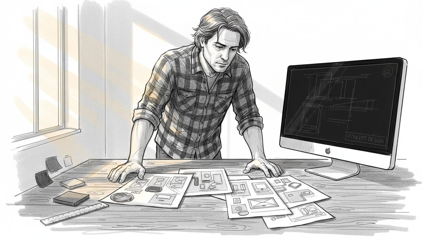
Building eye-catching product listings can feel overwhelming when you are piecing together files from different folders and scrambling for the right design assets. For Freelancers and entrepreneurs in the tech accessories market, a well-organized workspace and all your visual elements ready are crucial for efficient mockup creation. This guide delivers actionable steps, from gathering key branding assets to choosing intuitive design platforms, so you can create customizable templates that attract buyers worldwide.
Table of Contents
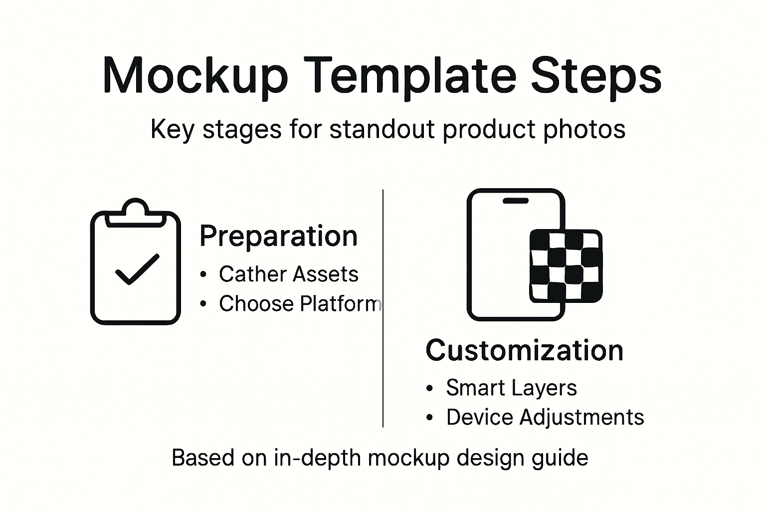
- Step 1: Set Up Your Workspace and Gather Assets
- Step 2: Select the Perfect Base Image or Mockup Scene
- Step 3: Design Editable Template Elements and Smart Layers
- Step 4: Apply Customizations for Phones, AirPods, and Gadgets
- Step 5: Test and Optimize Your Mockup Template for Real-World Use
Quick Summary
| Key Insight | Explanation |
|---|---|
| 1. Organize Your Assets | Collect all visual elements like logos and design files in one accessible place to streamline the design process. |
| 2. Choose the Right Platform | Pick a mockup tool that aligns with your skills and workflow for the best outcome in your designs. |
| 3. Select an Effective Base Image | Use high-quality scenes that match your product’s context to enhance the overall presentation. |
| 4. Utilize Smart Layers | Create editable layers in your mockup template for flexibility, allowing users to customize easily. |
| 5. Test for Real-World Use | Ensure your mockup maintains quality across devices and formats to meet customer expectations efficiently. |
Step 1: Set Up Your Workspace and Gather Assets
Before you dive into creating mockups, you need a solid foundation. This means setting up your workspace and collecting all the visual elements your product mockups will need. Think of this as gathering your ingredients before cooking, a step that determines how smoothly the rest of your process flows. You don’t want to be halfway through designing and realize you’re missing a logo file or your branding colors aren’t saved anywhere accessible.
Start by choosing a platform that fits your skill level and workflow. Canva Mockups offer AI-powered analysis that automatically suggests ideal product placement based on your images and branding elements. This means you can import your assets and let the platform do some of the heavy lifting for you. If you prefer more granular control and professional features, tools like Adobe Express provide blend modes and advanced color adjustments to integrate your designs seamlessly with existing product shadows and lighting. Sign up for whichever platform aligns with your process, and take a moment to explore the workspace layout. Most modern mockup tools position templates on the left, your design canvas in the center, and editing controls on the right. This arrangement becomes second nature quickly.
Now gather your assets into a single, organized location. You’ll need your product design files, brand logos, any additional artwork or graphics you want to include, and reference images of your actual products if you’re creating stylized versions. Collect brand colors, preferred fonts, and any texture files you might use. Store these in a dedicated folder on your computer or cloud storage so you can access them instantly without hunting through random directories. If you’re creating multiple mockups for different tech accessories like phone cases or AirPods cases, organize your assets by product category. This takes 15 minutes now and saves you hours later when you’re creating your fifth or sixth mockup.
Check that your image files are in formats your chosen tool accepts. Most platforms handle JPG, PNG, and PSD files without issues, but confirming this upfront prevents frustrating compatibility problems. If you have Photoshop files with layers, keep them as PSD since many professional tools preserve and work with that format more effectively. Consider the resolution of your images too, especially if you’re planning to use mockups for print or high-quality digital campaigns. Higher resolution files give you flexibility to crop, zoom, and adjust without losing quality later.
Here’s a comparison of popular mockup creation tools and their key features:
| Tool Name | Unique Features | Best For | File Compatibility |
|---|---|---|---|
| Canva | AI product placement, templates | Quick/easy mockups | JPG, PNG, SVG |
| Adobe Express | Advanced blend modes, pro edits | Custom designs | PSD, PNG, JPG, PDF |
| Photoshop | Smart layers, detailed controls | Professional workflows | PSD (layers), JPG, PNG |
| Freepik | Mockup libraries, high-quality | Variety of scenes | JPG, PNG, complex library use |
Pro tip: Create a mockup template checklist that lists every asset you need for each product category, then reuse it whenever you start a new design project. This prevents the frustrating discovery that you forgot to collect your brand’s accent color or a specific product angle photo halfway through the mockup creation process.
Step 2: Select the Perfect Base Image or Mockup Scene
Your base image is the stage on which your product performs. Everything else you add flows from this foundation, so choosing the right mockup scene directly impacts how professionally your final product presentation appears. The base image sets the mood, establishes context, and determines whether your tech accessory looks like a premium item or an afterthought. You need a scene that not only showcases your product but also tells a story about who would use it and why they’d want it.
Start by considering what context makes sense for your specific product. If you’re selling phone cases, your base image should feature a smartphone in a relatable environment. For AirPods cases, you might choose a scene with a workspace, travel setting, or lifestyle context that appeals to your target customers. The key is matching your mockup scene to the product category and the environment where customers actually use it. When selecting a base image, look for high-quality mockup scenes that offer multiple angles and lighting options. You can either browse pre-made scenes from mockup libraries or upload your own photography if you want complete creative control. Pre-made scenes save time and typically include professional lighting already optimized for product display, while custom photography gives you unique branding opportunities that your competitors might not have.
Examine the base image for flexibility and customization potential. You want a scene with adjustable elements like customizable layers for colors, shadows, and backgrounds so you can match your brand identity and target environment precisely. Look at how the lighting falls across the device or product surface. Does it create shadows that look natural and appealing, or harsh lines that might distract from your design? Check whether the background complements or competes with your product. A busy, colorful background might work for vibrant, playful designs, but it could overwhelm minimalist or luxury products. The angle matters too, whether the device is positioned straight-on, at a slight tilt, or flat against a surface. Different angles convey different messages. A tilted phone case on a desk suggests everyday use, while a straight-on angle feels more formal and focused on the design itself.
Once you’ve chosen your base image, test how your product design sits within that scene before committing to final adjustments. Import your design onto the mockup and see how the colors interact with the background. Does your design pop visually, or does it disappear into the scene? If you’re using adjustments to lighting, size, and positioning, make these tweaks at this stage so you can evaluate the complete composition. You might discover that your design needs a slight color shift or size adjustment to truly shine within this particular scene. Don’t skip this visual check just because the mockup looked good in isolation. The whole point is creating a presentation where your product looks irresistible to potential customers scrolling through your online store.
Pro tip: Keep a collection of three to five base images across different styles, moods, and device angles, then test your design on each before choosing your final mockup. This prevents the common mistake of creating stunning designs that look mediocre in a particular scene, and it ensures you have versatile mockups ready for different marketing contexts like social media, email campaigns, and product listings.
To help you select the best mockup scene, here is a summary of base image characteristics for top tech products:
| Product Type | Recommended Context | Key Customization | Impact on Design Standout |
|---|---|---|---|
| Phone Case | Desk/workspace scene | Screen reflection, bezel | Enhances realism |
| AirPods Case | Lifestyle/travel setting | Case color, logo, lighting | Highlights branding |
| MacBook/Tablets | Office or creative setup | Screen content, finish | Positions design as premium |
| Smartwatch | Close-up, hand-in-shot | Watch face, band color | Boosts visual boldness |
Step 3: Design Editable Template Elements and Smart Layers
This is where your mockup transforms from static to dynamic. Creating editable template elements and smart layers means building flexibility into your design so you and your customers can adapt the mockup for different products, colors, and branding needs. Smart layers are the difference between a single-use mockup and a reusable template that generates value for months or years. When you set these up correctly, you create templates that work across multiple product variations without starting from scratch each time.
Begin by identifying which elements of your mockup need to remain editable. Your design layer is the obvious one, but consider what else might change depending on who uses the template. Perhaps the background color needs adjustment for different marketing campaigns. Maybe the text overlay should swap out for different product names or taglines. The device color itself might vary if you’re selling phone cases in multiple finishes. Start with your primary design layer, the one where customers will place their artwork. In most design tools, this means creating a clearly labeled smart object or layer group that’s easy for users to locate and edit. Name it something obvious like “Design Placement Here” or “Your Art Goes Here” so there’s zero confusion about what goes where.
Set up smart layers by establishing guides and boundaries that show users exactly where their design should fit. Use guides to mark safe zones where text and images should stay contained so they don’t get cut off when the mockup is applied to actual products. If you’re using Photoshop or a similar program, create layer clipping masks that constrain edits to the correct area. This prevents accidental overflow and maintains the professional appearance of your template. You can also set up separate layers for optional elements like shadows, highlights, or reflections that give depth to the mockup. Label these layers clearly and group related elements together so users understand the visual hierarchy. If your template includes text that might change, create editable text layers with formatting already applied. Set your font, size, and color so users just need to swap in their own copy without fiddling with typography basics.
Consider adding color overlay layers that users can modify to match their branding without editing the entire design. A color adjustment layer or a smart filter applied to specific sections lets someone change the device color, background tone, or accent colors while preserving the mockup’s professional lighting and shadows. This creates tremendous flexibility with minimal complexity for the end user. Test your editable layers by actually editing them yourself. Replace your sample design with something completely different in color, style, and content. Does everything still look professional? Do the layers respond the way you expect? Do any guides or masks cause problems? This quality check now prevents frustrated customers later who discover their design doesn’t fit properly or looks distorted when they edit the template.
Organize your layer structure logically before finalizing. Group background elements together, device elements in another section, and editable areas in their own folder. Use layer naming conventions that make sense at a glance. Instead of generic names like “Layer 1” or “Group 5,” use descriptive names like “Phone Device,” “Design Area,” “Background Color,” and “Shadow Effects.” When someone opens your template months from now, clear naming saves them minutes or even hours trying to figure out what each layer does. This organization also makes your template feel more professional and polished, which translates into better customer satisfaction and fewer support questions.
Pro tip: Create a template instruction layer or a separate PDF guide that shows users exactly which elements are editable, where to place their design, and what file formats or dimensions work best. Many template creators skip this step and then field endless customer questions that a simple visual guide would have answered instantly.
Step 4: Apply Customizations for Phones, AirPods, and Gadgets
Each product category demands specific customization attention. Phones, AirPods cases, and other tech gadgets have unique visual characteristics that make them instantly recognizable, and your mockups need to honor those details to look authentic. The difference between a mediocre mockup and a stunning one often comes down to how carefully you handle these product-specific customizations. When you get these details right, your mockup looks professional enough that customers genuinely believe they’re seeing a real product photo.
Start with phones, the most common tech accessory mockup. Your primary focus is the screen reflection and bezel. The screen itself should display your design cleanly, but you also need to account for the natural reflection that occurs on glass. Most phone mockups include a highlight layer that simulates this reflection, and you’ll want to adjust its opacity so it looks natural rather than plastic or overly glossy. The bezel, the frame around the screen, often has color options. Customize this to match your branding or the specific phone model you’re showcasing. Pay attention to the texture of the phone body itself, whether it’s matte, glossy, or has a specific finish. If your template allows, you can adjust the phone color to match whatever device you’re selling cases for, making the mockup feel personally relevant to customers browsing your listings. The shadows beneath and around the phone are equally important. These shadows ground the device and make it feel three-dimensional rather than floating. Leave them in place unless you have a specific reason to modify them.
AirPods cases require a different approach because they’re smaller and sit in a specific spatial context. The case itself often appears against a background or lifestyle setting, so focus your customization efforts on the case color, any text or logos on the case, and how light plays across the glossy or matte surface. If your template includes the AirPods themselves, ensure their color and positioning match the case aesthetic. The charging indicator light, if visible in your mockup, should be customizable if different color variants exist. Many freelancers selling AirPods case designs benefit from having multiple mockup templates that showcase different perspectives, like a complete AirPods case mockup package with multiple scenes to demonstrate versatility to potential customers. Consider whether your mockup shows the case open or closed, as this affects how your design displays and what details customers can see.
Other gadgets like MacBooks, tablets, or smartwatches each have their own requirements. For MacBooks, the screen content is paramount since customers are essentially buying to see their design displayed on a realistic laptop screen. Customize the screen brightness, the surrounding aluminum finish color, and ensure the keyboard and trackpad are visible enough to add context without overwhelming your design. For tablets, consider whether the mockup shows the device in landscape or portrait orientation and whether a hand is holding it, which adds lifestyle context. With smartwatches, the face size is small, so your design needs to be bold and legible. The watch band color should be customizable to show how your design works with different band options. The key across all these products is making precise adjustments for device texture, highlight reflections, and realistic shadows to enhance visual appeal.
Test your customizations by actually using them. Change the phone color, modify the case design, adjust the screen content, and view the result from different angles if your template allows. Does the design still pop visually? Do the reflections and shadows still look natural after your changes? Does the overall composition feel balanced? Pay special attention to contrast, ensuring your design stands out against the background rather than blending in. If certain areas look flat or unconvincing, you can add additional layers or adjust existing ones. The goal is creating mockups that look so realistic customers can almost reach out and touch the product.
Pro tip: Create separate template variations optimized for different product categories rather than forcing one template to work for phones, cases, and gadgets. A phone mockup template optimized for screen real estate differs fundamentally from an AirPods case template, and designing templates specific to each category results in more professional, conversion-focused mockups that actually sell products.
Step 5: Test and Optimize Your Mockup Template for Real-World Use
A beautiful mockup that only works in theory is worthless. Real-world testing separates templates that actually sell products from ones that look good but frustrate users. This step means putting your mockup through its paces across different scenarios, platforms, and use cases before you release it to customers or start relying on it for your product listings. You’ll catch problems now that would otherwise generate support questions or cause sales to suffer.
Start by testing your mockup on the actual devices and platforms where it will appear. If your mockup is for a phone case, view it on a desktop monitor, tablet, and smartphone itself. Does the resolution hold up when viewed on a small screen? Are the colors accurate across different devices, or does your mockup look washed out on one display and oversaturated on another? Export your mockup in the formats you plan to use for marketing, whether that’s JPG for social media, PNG for product listings, or PDF for print. Test each export format to verify that the colors, shadows, and overall appearance remain consistent. If you’re selling on multiple platforms like Amazon, Etsy, and Shopify, export mockups and view them within each platform’s actual product listing template. This reveals spacing issues, aspect ratio problems, or lighting mismatches you wouldn’t catch viewing the raw image file.
Next, verify that your smart layers actually work as intended. Have someone unfamiliar with your template open the PSD file and try to edit it. Can they find the correct layers? Do they understand where to place their design? When they swap in a completely different design, does everything align properly or do elements shift unexpectedly? Test with various design styles too. Replace your sample design with something bold and saturated, then try a minimalist black and white design. Does your mockup adapt beautifully to both, or does one style expose problems with the layer structure or lighting? Test with text-heavy designs and image-heavy designs. If there’s a text overlay element in your mockup, try using extremely long text strings to see if they overflow or break the layout. These real-world scenarios reveal whether your template is truly versatile or just works with specific design types.
Evaluate smart layer functionality and responsiveness across different design swaps to ensure your template handles varied content reliably. Pay attention to file size and loading performance too. A mockup template that’s 500 MB will frustrate customers trying to download and work with it. Optimize your file by flattening unnecessary layers, compressing embedded graphics, and removing any unused assets. However, don’t compress so aggressively that image quality suffers when customers zoom in or export at high resolution. The sweet spot is usually between 50 and 150 MB for a professional PSD template. Test the export quality at various sizes. Export at 100 percent resolution, then at smaller sizes that might be used for social media thumbnails. Does the mockup maintain clarity and appeal at all sizes, or does it only look good at full resolution?
Consider optimizing mockup templates through iteration and testing different export formats compatible with marketing platforms. If you’re planning to sell this template to others or use it extensively yourself, test it in different design software if possible. A Photoshop file might look perfect in Photoshop but behave differently when opened in GIMP or another editor. Test how the template performs when users work on different operating systems too. A mockup created on Mac might render slightly differently on Windows due to font rendering and color space differences. Create a simple checklist of what needs to pass testing before you finalize the template. This might include color accuracy verification, shadow and reflection realism, smart layer functionality with multiple design styles, file size optimization, cross-platform compatibility, and export quality in various formats. Document any issues you find and fix them before moving to the next stage.
Pro tip: Ask three people outside your immediate circle to test your mockup template using their own designs and give you honest feedback about usability and visual quality. External testers catch problems you’ve become blind to after working on the template for hours, and their feedback directly improves the final product you’ll sell or use.
Elevate Your Product Photos with Professional Mockup Templates
Struggling to create stunning product photos that capture attention and boost sales? This article highlights the challenges of setting up editable mockup templates with smart layers, customizing for specific tech gadgets, and ensuring your designs look photorealistic and professional. If you want to eliminate the hassle of complicated setup and deliver flawless visuals every time, there is a better way.
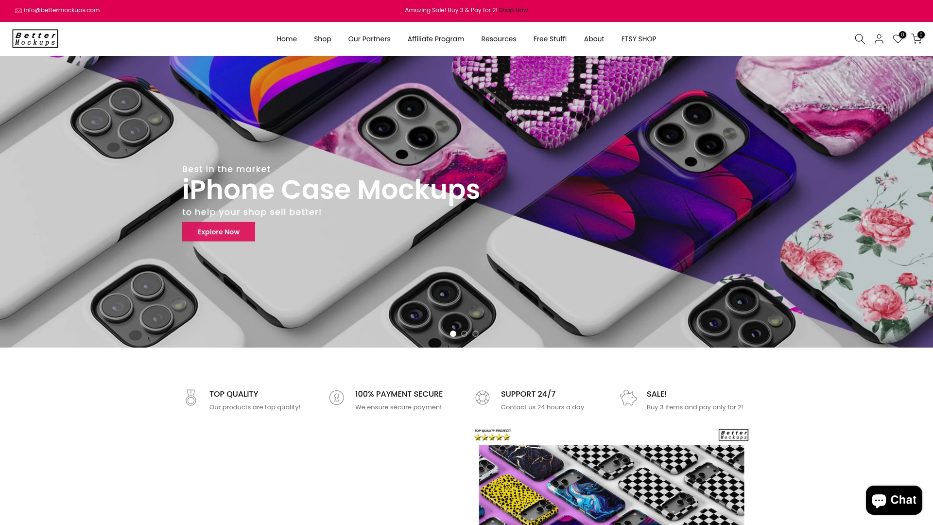
Unlock a huge collection of ready-to-use, high-quality mockup templates tailored for phone cases, AirPods cases, and electronic accessories at Bettermockups. Explore specialized collections like Phone Ring Holder Mockups – Bettermockups or innovative Wireless Charger Mockups – Bettermockups that seamlessly integrate with your branding. Designed for entrepreneurs and online sellers, these templates save you time, reduce frustration, and make your product listings irresistible. Visit the site now and start creating photorealistic mockups that truly elevate your brand.
Frequently Asked Questions
How do I set up my workspace for creating mockup templates?
To set up your workspace, choose a design platform that suits your skill level and workflow. Spend time organizing your assets into a dedicated folder containing product designs, logos, colors, and reference images to streamline the mockup creation process.
What types of visual elements should I gather before starting mockup designs?
Gather essential visual elements such as product design files, brand logos, fonts, textures, and reference images. Organizing these assets upfront allows you to easily access everything you need to create stunning mockups without delays.
How can I ensure my mockup templates have editable elements?
To create editable elements in your mockup template, identify key areas such as design layers, backgrounds, and text. Set up smart layers and clear guides that allow users to easily swap in their own designs while maintaining a professional appearance.
What should I consider when selecting the base image for my mockup?
Choose a base image that showcases the product in a relatable environment and matches the product category. Ensure the scene offers customization options, such as adjustable colors and lighting, to create a visually appealing presentation that resonates with your target audience.
How do I test my mockup templates for practical use?
Test your mockup templates by checking them on actual devices and platforms where they will be used. Export the templates in different formats and ensure that all layers function correctly and maintain visual quality across various design styles.
What adjustments should I make for different tech product mockups?
Focus on specific customization details for each tech product, such as screen reflections for phones and case colors for AirPods. Make these adjustments carefully to enhance realism and ensure that your mockups present the products authentically and attractively.


