
Your phone case listings look different on every platform. Your Instagram posts don't match your Etsy shop. Your TikTok videos feel disconnected from your website. This isn't a creative problem, it's a documentation problem. Without brand photography guidelines, every new mockup, product shot, or promotional image becomes a coin flip between on-brand and off-brand.
A photography style guide does what intuition can't: it turns visual consistency from a daily judgment call into a repeatable system. Clear documentation means any mockup you create, whether for an iPhone 17 launch or a seasonal campaign, carries the same visual identity that customers recognize and trust.
This guide gives you the instructions, templates, and examples to build a style guide that works for POD operations. From defining lighting standards to documenting how you'll use production-accurate mockups from platforms like Bettermockups, you'll walk away with a framework that keeps every listing, ad, and social post visually aligned, without requiring the same judgment calls over and over again.
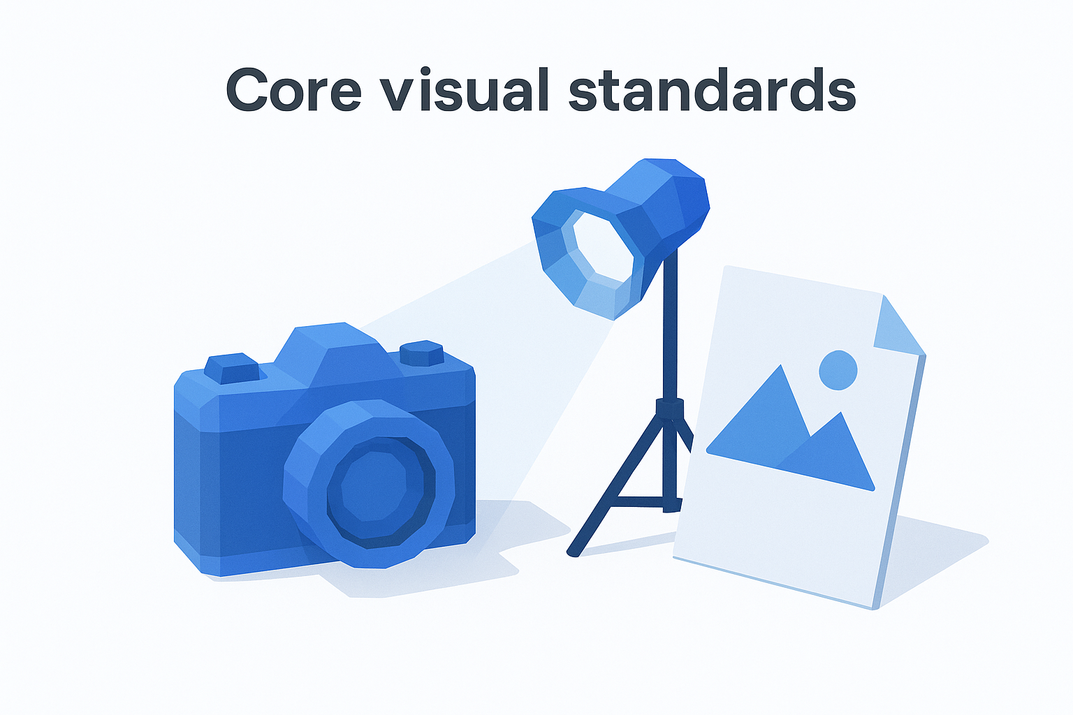
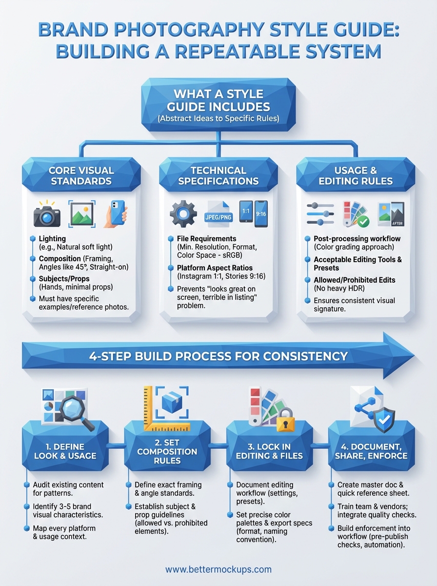
What a brand photography style guide includes
A brand photography style guide is a reference document that defines every visual decision before you make it. You need written standards for lighting, composition, color treatment, subjects, backgrounds, and file specifications. This document turns abstract ideas about your brand's look into specific rules that anyone creating content for your shop can follow.
Core visual standards
Your guide starts with the visual fundamentals that define your brand's look. You document your preferred lighting style (natural soft light, studio lighting with diffusers, backlit for drama), your background requirements (solid colors, textured surfaces, lifestyle environments), and your angle preferences (straight-on, 45-degree, overhead flatlays). You establish whether your brand uses human hands in shots, whether products float on white or sit on real surfaces, and whether you allow props or keep compositions minimal.
These standards need specific examples. Instead of writing "use good lighting," you document that all mockups use soft natural light from a north-facing window between 10 AM and 2 PM, or that studio shots require a two-light setup with a 5:1 key-to-fill ratio. You attach reference photos that show exactly what you mean.
Technical specifications
Your guide must include the file requirements for every platform you publish on. You define minimum resolution standards (3000px on the longest edge for print, 2048px for web), acceptable file formats (PNG for transparency, JPEG for speed), and color space requirements (sRGB for digital, Adobe RGB for print). You specify aspect ratios for each platform: 1:1 for Instagram grid posts, 9:16 for Stories and Reels, 4:5 for feed optimization on Facebook.
Clear technical specs prevent the "looks great on my screen, terrible in the listing" problem that costs you conversions.
Include a quick reference table that your team can check before exporting:
| Platform | Dimensions | Format | Color Space | Max File Size |
|---|---|---|---|---|
| Etsy Listings | 2000x2000px min | JPEG | sRGB | 10MB |
| TikTok Shop | 1080x1080px | JPEG/PNG | sRGB | 5MB |
| Instagram Feed | 1080x1080px | JPEG | sRGB | 8MB |
Usage and editing rules
Your brand photography guidelines need to document post-processing standards. You define your color grading approach (warm tones with +15 temperature, desaturated blues, high-contrast blacks), your acceptable editing tools (Lightroom presets, Photoshop actions, specific filter settings), and what edits you never allow (heavy HDR, artificial bokeh, oversaturation). You establish whether you crop mockups tight to the product or leave breathing room, whether you add text overlays or keep images clean, and how you handle batch editing for consistency across hundreds of listings.
Step 1. Define the brand look and usage needs
You start by identifying your brand's visual identity and where those images will actually appear. This step captures the aesthetic decisions that separate your brand from generic POD shops and documents every platform and use case your photos need to serve. You're not creating abstract mood boards here, you're defining specific visual standards that match how your customers already perceive your brand.
Identify your visual identity
Your first task is to audit your existing content and identify what's already working. Pull your top-performing listings from Etsy, your highest-engagement Instagram posts, and your best-converting TikTok Shop videos. Look for visual patterns: Do your successful posts use bright backgrounds or muted tones? Do customers respond better to lifestyle shots with hands holding the phone or clean product-only compositions? Document these patterns as your starting reference points.
Write down three to five specific visual characteristics that define your brand. Examples: "Soft shadows with natural window lighting," "Minimalist white backgrounds with subtle texture," "Warm color grading with +20 temperature shift," "Always show MagSafe ring clearly visible," "Product occupies 60-70% of frame." These become the foundation of your brand photography guidelines.
Document every usage context
List every platform and format where your photos appear. Your mockups serve different purposes: Etsy listing images need to show product details clearly, Instagram posts prioritize aesthetic appeal, TikTok Shop videos require motion and context, email campaigns need banner-friendly dimensions, and print materials demand higher resolution.
Create a simple usage matrix:
| Context | Primary Goal | Key Requirement |
|---|---|---|
| Etsy listing photo 1 | Show design clearly | Clean, accurate mockup |
| Instagram feed | Brand recognition | Consistent color treatment |
| TikTok Shop video | Demonstrate use case | Motion, lifestyle context |
| Email header | Click-through | Text-safe composition |
Your photography standards must work across every context where customers encounter your brand, not just your main storefront.
This matrix guides every subsequent decision in your style guide.
Step 2. Set the rules for composition and subjects
Your brand photography guidelines need specific composition rules that define how products appear in every frame. This step documents your framing standards, angle requirements, and subject guidelines so that every mockup follows the same visual structure. You're establishing the spatial relationships and visual elements that make a photo unmistakably yours.
Establish framing and angle standards
You define exact framing rules for how products occupy the frame. Document whether your phone case mockups fill 60% of the image with white space around them, or whether they sit at 80% for maximum detail visibility. Specify your preferred shooting angles: straight-on at eye level for clean product shots, 45-degree angle to show depth and dimension, or overhead flatlay for lifestyle contexts.
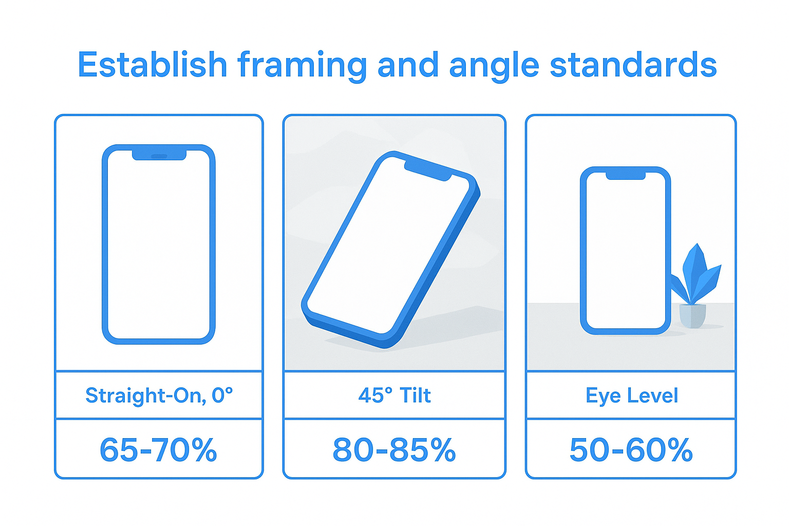
Create a visual reference table:
| Shot Type | Angle | Product Frame Coverage | Background |
|---|---|---|---|
| Primary listing | Straight-on, 0° | 65-70% | Solid white |
| Detail shot | 45° tilt | 80-85% | Subtle texture |
| Lifestyle | Eye level | 50-60% | Real environment |
Your framing standards should specify margin requirements (minimum 10% breathing room on all sides) and alignment rules (product centered, or rule-of-thirds for lifestyle shots).
Define subject and prop guidelines
Your brand photography guidelines must document what appears in your shots beyond the product itself. You establish whether you show hands holding the phone (and if so, what skin tones, nail polish, jewelry), whether you include lifestyle props (coffee cups, laptops, plants), and whether you allow text overlays or graphic elements in the composition.
Document exactly what belongs in frame and what stays out, so every image reinforces the same brand story.
List your allowed and prohibited elements. Allowed: clean hands without rings, matte surfaces as bases, Apple products as secondary items. Prohibited: branded competitor products, cluttered backgrounds, people's faces. Include reference photos showing both correct and incorrect examples.
Step 3. Lock in editing, color, and file standards
Your brand photography guidelines need documented editing standards that ensure every image carries the same visual signature. This step captures your color treatment, post-processing workflow, and technical export settings so that mockups created six months apart look like they came from the same photoshoot. You're building a repeatable system that removes guesswork from every edit.
Define your editing workflow
You document every adjustment you make to raw mockup files before they go live. Start by listing your Lightroom or Photoshop settings: exposure adjustments (+0.3 stops), contrast modifications (+15), white balance shifts (temperature +200K, tint +5), and saturation rules (reduce blues by 10%, boost oranges by 5%). Record whether you apply sharpening (amount 40, radius 1.0, detail 25) and noise reduction (luminance 20, color 25).
Create a numbered checklist that anyone can follow:
- Import mockup at native resolution
- Apply exposure correction (+0.3 stops)
- Adjust white balance (Temp: 5700K, Tint: +8)
- Increase contrast (+12)
- Apply color grading preset "Brand_Warm_2024"
- Sharpen for screen (Smart Sharpen, 0.8px radius, 85%)
- Export using documented file standards
Document your exact editing sequence so that batch processing 200 listings produces identical color treatment across every image.
Set color and export specifications
Your brand photography guidelines must include exact color values and export parameters. Define your primary color palette in multiple formats: HEX codes for web (#F4E4D7 for backgrounds), RGB values for Photoshop (244, 228, 215), and CMYK for any print needs. Specify your color space requirements (sRGB for all digital platforms, Adobe RGB only for professional print) and your color profile embedding rules (always embed for cross-platform consistency).
Document your export settings template:
| Setting | Value | Purpose |
|---|---|---|
| Format | JPEG | Universal compatibility |
| Quality | 90% | Balance size/quality |
| Resolution | 2400x2400px | Meets all platform minimums |
| Color Space | sRGB | Digital standard |
| Metadata | Strip EXIF | Reduce file size |
Include your file naming convention (Brand_Product_Variant_Platform_Date.jpg) so exported files stay organized across hundreds of listings.
Step 4. Document, share, and enforce the guide
Your brand photography guidelines only work if everyone creating content can access them and knows they must follow them. This step transforms your documented standards into a living reference system that your team, freelance designers, and mockup vendors consult before every photoshoot or edit. You're building enforcement mechanisms that make following the guide easier than ignoring it.
Create the master documentation
You compile all your standards into a single master document that serves as your brand's visual rulebook. Structure this document with clear sections: Visual Identity Standards, Composition Rules, Editing Specifications, Technical Requirements, and Usage Guidelines. Include reference photos for every standard (correct examples and common mistakes), your color palette with exact values, and your export settings checklist.
Create a one-page quick reference sheet:
BRAND PHOTOGRAPHY QUICK REFERENCE
Lighting: Natural soft light, 10AM-2PM window
Angles: Straight-on (0°) for primary, 45° for detail shots
Framing: Product fills 65-70% of frame, centered
Background: Solid white (#FFFFFF) or subtle texture
Editing: Lightroom preset "Brand_2026", +0.3 exposure, Temp 5700K
Export: 2400x2400px JPEG, 90% quality, sRGB color space
Store your master guide in a format everyone can access: a shared Google Doc for text standards, a Dropbox folder with reference photos, and a Notion database for searchable specifications.
Distribute and train your team
You share the guide with every person who touches your visual content, including your in-house team, freelance photographers, graphic designers, and mockup creators. Send new collaborators the full guide plus the quick reference sheet before their first project. Schedule a 15-minute walkthrough where you show examples of correct and incorrect applications of your standards.
Your brand photography guidelines only protect consistency when everyone creating content knows they exist and understands how to apply them.
Require vendors to confirm they've reviewed the guide before starting work. Add a clause to your freelance contracts that all delivered assets must meet documented specifications or require revision at no extra cost.
Build enforcement into workflow
You integrate quality checks at specific points in your production process to catch violations before they go live. Create a pre-publish checklist that verifies every image against your documented standards: correct dimensions, proper color grading applied, acceptable composition, required metadata. Assign one team member as brand consistency reviewer who approves all photos before they publish.
Set up automated checks where possible. Use Photoshop actions or Lightroom presets that apply your exact editing standards to batch uploads. Configure your content management system to reject files that don't meet minimum resolution or color space requirements. Schedule quarterly reviews of published content to identify drift from your standards and update your guide based on what's working.
Next steps for consistent photos
Your brand photography guidelines now exist as a documented system instead of scattered decisions. You have written standards for composition, lighting, editing, and technical specs that anyone creating content for your shop can follow. This document removes guesswork from every mockup you create and every listing you publish, turning visual consistency from a daily judgment call into a repeatable process.
Apply your documented standards to your next batch of product listings. Start with your highest-traffic products and verify that every image meets your framing rules, color treatment, and export specifications. Use your quick reference checklist to audit existing content and identify where inconsistencies appear. Fix those discrepancies so customers see the same visual identity whether they find you on Etsy, Instagram, or TikTok Shop.
Production-accurate mockups make your brand photography guidelines work. When your templates match actual manufactured cases, every published image becomes a promise you can keep. Browse BetterMockups' library of device-specific templates built to real case specifications, so your visual standards deliver both consistency and accuracy.


