
Every tap, scroll, and swipe on a screen involves movement, and the difference between an interface that feels intuitive and one that feels broken often comes down to motion design principles. These aren't decorative flourishes. They're the rules that govern how elements enter, exit, and respond to interaction, giving users the spatial and temporal cues they need to understand what just happened and what to do next.
If you design digital products, whether that's a SaaS dashboard, a mobile app, or an e-commerce listing page, motion is already part of your work. The question is whether it's intentional. Poorly executed animation creates confusion, slows task completion, and erodes trust. Purposeful motion does the opposite: it builds hierarchy, directs attention, and makes complex interfaces feel simple. That gap between accidental and intentional is exactly what these principles address.
At Bettermockups, we apply these same principles when building video mockup templates for print-on-demand sellers. Our motion assets, used across TikTok Shop listings, social ads, and product pages, rely on timing, easing, and choreography to present phone case designs accurately and persuasively. We've seen firsthand how much motion quality affects conversion.
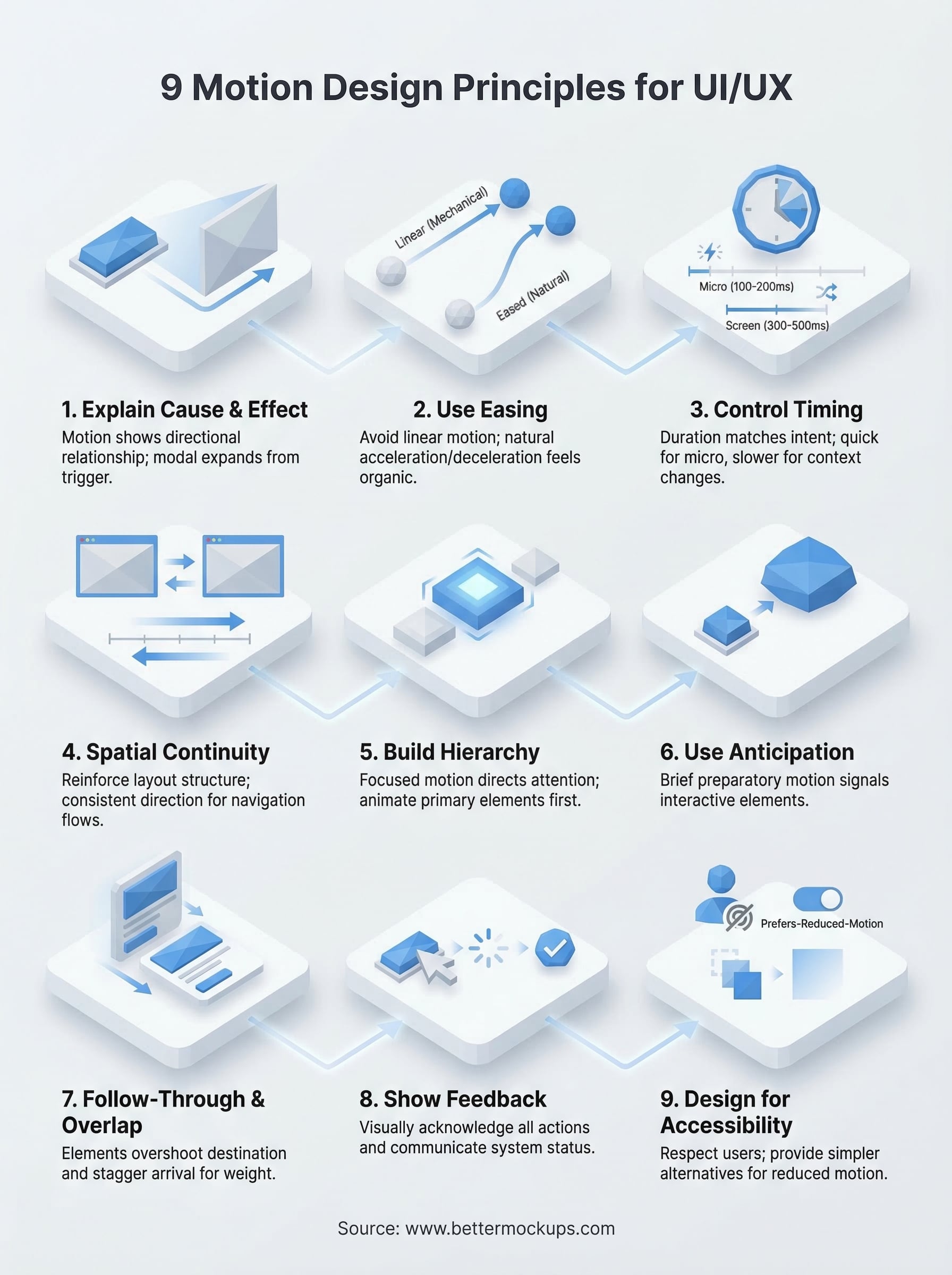
This guide breaks down nine core motion design principles every UI/UX product designer should know right now, with practical applications you can use immediately, whether you're animating a checkout flow, a micro-interaction, or a product showcase.
1. Motion should explain cause and effect
Every interface action creates a result, and motion is the connective tissue between the two. When you tap a button and something changes on screen, animation bridges that gap by showing where something came from, where it went, and why. This is the most foundational of all motion design principles: motion should always explain cause and effect, not just decorate it.
What it means in UI/UX
In UI/UX, cause-and-effect motion means every visual change on screen has a directional relationship to the action that triggered it. A modal doesn't just appear; it slides up from the button that launched it. A deleted item doesn't vanish; it contracts and fades in the direction it was removed. Users build a mental model of your interface through these spatial cues, and when motion reinforces that model, navigation becomes instinctive rather than learned.
Motion that explains cause and effect reduces the cognitive load users carry when navigating an unfamiliar interface for the first time.
How to apply it in real interfaces
Start by mapping every trigger-response pair in your interface. For each user action, identify what changes on screen and design the motion to reflect that relationship spatially. A card expanding into a full-screen detail view should grow from the card's own position, not appear from the top of the screen. Transitions that originate from the trigger point reinforce ownership and reduce disorientation.
Pay particular attention to destructive actions. When your user deletes, archives, or dismisses something, animate the removal in a direction that signals finality. Swiping left to delete? Animate the exit to the left. This spatial consistency teaches your interface's logic without a single line of instructional copy.
Common mistakes to avoid
The most common error is treating motion as visual style rather than communication. An animation that looks polished but moves in the wrong direction actively misleads users about how the interface is organized.
Another frequent mistake is animating only some cause-and-effect pairs and leaving others static. That inconsistency creates a fractured experience users feel even when they can't articulate why they're confused.
Quick checklist
Run through these checks before shipping any transition:
- Does the animation originate from or travel toward the element that triggered it?
- Does the motion direction match the spatial layout of your interface?
- Would a first-time user understand what happened based on the animation alone?
2. Use easing to make motion feel natural
Linear motion, where an element moves at the same speed from start to finish, looks mechanical. Nothing in the physical world moves that way. Easing is the principle that controls acceleration and deceleration within an animation, and it's what separates motion that feels natural from motion that feels robotic. Across all motion design principles, easing is the one most immediately felt by users even when they can't name it.
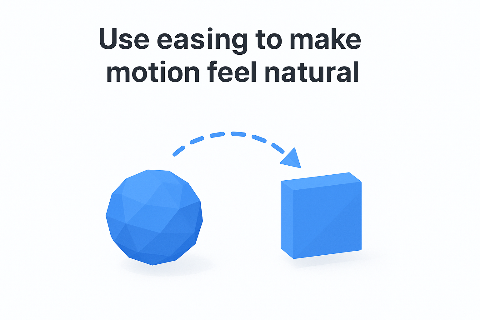
What it means in UI/UX
Easing curves define how an element speeds up or slows down over the duration of an animation. Ease-in means the element accelerates as it moves. Ease-out means it decelerates toward the end. Ease-in-out combines both. In UI/UX, the right curve depends on context: elements entering the screen typically use ease-out (they arrive quickly and settle), while elements exiting use ease-in (they start slow and leave fast).
The easing curve you choose communicates weight and purpose; a heavy modal should decelerate differently than a lightweight tooltip.
How to apply it in real interfaces
When you configure easing in CSS, Figma, or After Effects, avoid default "ease" curves and instead customize your bezier values to match the physical properties of the element. Heavier elements need more aggressive deceleration. Quick confirmations like toast notifications benefit from a sharp ease-out so they appear responsive rather than sluggish.
Common mistakes to avoid
Applying linear easing to every transition is the most widespread mistake. It makes your interface feel like a slideshow rather than a product. Equally problematic is using ease-in for entering elements, which makes them feel like they're crawling onto screen.
Quick checklist
- Do entering elements use ease-out?
- Do exiting elements use ease-in?
- Have you removed all linear easing from user-facing transitions?
3. Control timing to match user intent
Timing is the duration of an animation, and it directly shapes how your interface responds to the user's pace and purpose. Motion design principles that ignore timing produce interfaces where transitions either drag users through a slow experience or rush past changes before users register them. Getting timing right means calibrating your animation durations to match what the user is trying to accomplish at that exact moment.
What it means in UI/UX
Duration in UI/UX is not a fixed value you apply universally. Quick micro-interactions, like button presses or toggle switches, should complete in 100-200ms. Larger transitions that move users between views or contexts need more time, typically 300-500ms, so users can track what changed and orient themselves in the new state.
Timing that matches the complexity of the change signals to users that the interface is paying attention to what they're doing.
How to apply it in real interfaces
Start by categorizing your animations by scale and complexity. Small, contained interactions get short durations. Screen-level transitions get longer ones. You can also adjust timing based on user-initiated vs. system-initiated changes: actions the user explicitly triggers can move faster because they already anticipate the result, while system notifications need slightly longer durations to draw attention.
Common mistakes to avoid
Using the same 100ms duration for every animation regardless of scale makes large transitions feel abrupt and disorienting. Setting durations over 500ms for frequent interactions like form field validation or button taps creates friction that compounds across a session and frustrates repeat users.
Quick checklist
Use these checks before finalizing any duration to make sure timing serves the user rather than slowing them down:
- Do micro-interactions complete in under 200ms?
- Do screen-level transitions stay within 300-500ms?
- Does system-initiated motion use longer durations than user-triggered motion?
4. Keep spatial continuity across transitions
Spatial continuity is the principle that elements should move consistently with how your interface is laid out. When a user navigates forward in a flow, content enters from the right. Going back brings content from the left. This spatial logic gives users a reliable mental map of where things live inside your product, and it's one of the motion design principles that most directly reduces navigation errors.
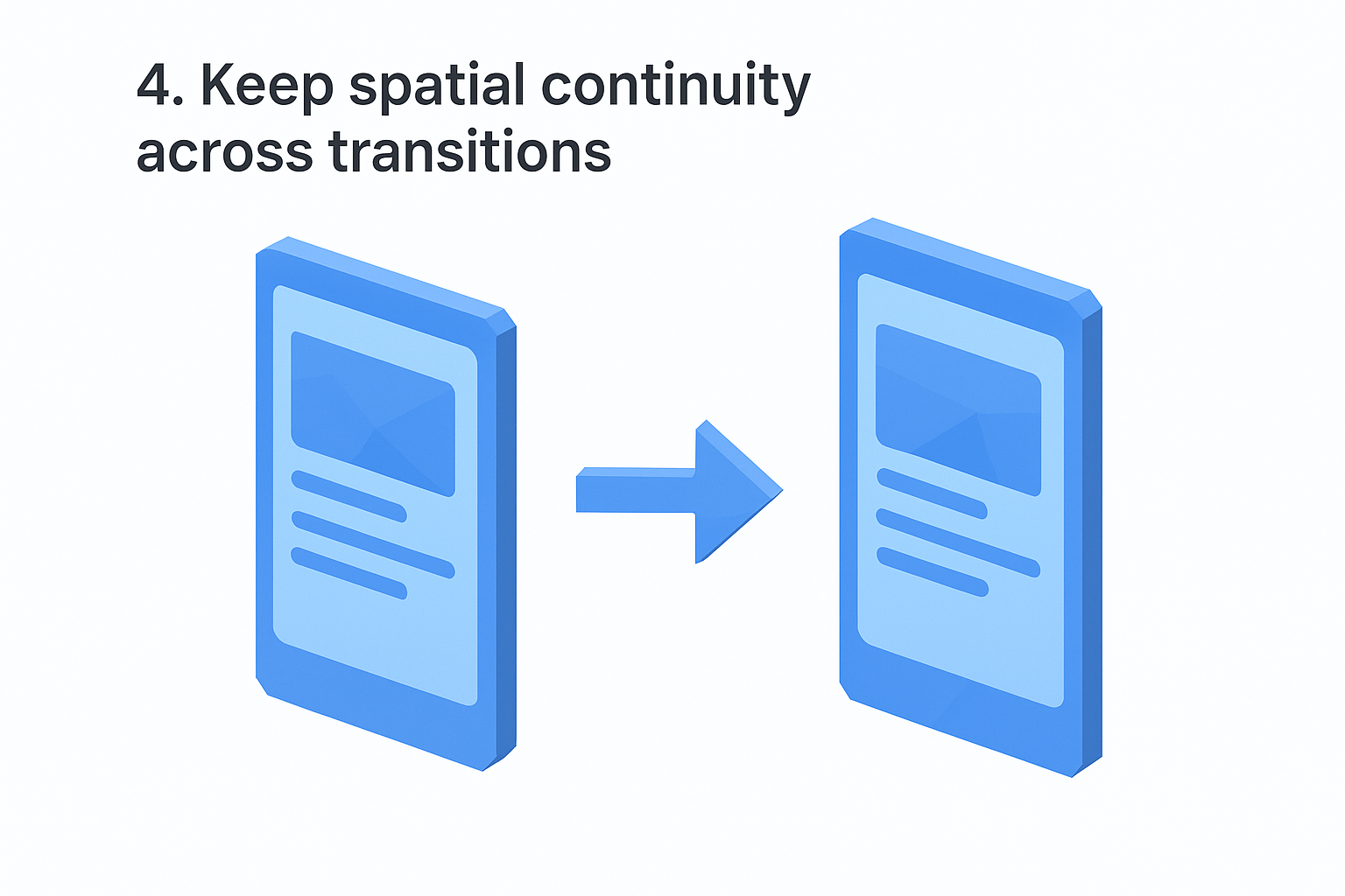
What it means in UI/UX
Spatial continuity means your transitions reinforce the physical structure of your interface rather than contradict it. If your app uses a tab bar with sections arranged horizontally, transitions between those sections should move horizontally. Mixing directions inside the same navigational context breaks the spatial contract users build after their first few interactions.
When your transitions align with your layout structure, users stop thinking about navigation and start focusing on the task.
How to apply it in real interfaces
Map your interface hierarchy before you assign any transition directions. Vertical scrolling flows work with vertical slide transitions. Drill-down navigation from a list to a detail view works with a rightward push that implies depth. The direction you choose for each transition should reflect the structural relationship between the two views, not a stylistic preference.
Common mistakes to avoid
Applying random or inconsistent transition directions across screens is the fastest way to disorient your users. Another common error is using the same transition for both forward and backward navigation, which removes the directional signal that tells users where they are in the flow.
Quick checklist
- Do transition directions match your layout's spatial structure?
- Do forward and backward navigation use opposing directions?
- Is the same transition logic applied consistently across every screen in the flow?
5. Build hierarchy with focused motion
Not everything on your screen deserves equal attention, and focused motion is how you communicate that difference without adding visual clutter. When one element animates and others stay still, your user's eye goes directly to what moved. That's hierarchy in action, and it's one of the motion design principles that most directly improves task completion by telling users exactly where to look.
What it means in UI/UX
Hierarchy through motion means animating the right element at the right moment, not every element at once. When multiple elements animate simultaneously with equal intensity, nothing reads as primary. Your interface needs a clear visual order that guides users through what matters first, second, and third without requiring them to figure it out on their own.
Focused motion is a directing tool; the element that moves first and most prominently is the one your user registers as most important.
How to apply it in real interfaces
Use staggered timing to sequence animations so elements appear in order of importance. Your primary call-to-action should animate before supporting content. Secondary elements can follow with a short delay, typically 50-100ms apart, reinforcing the reading order you've established through your layout and typography choices.
Common mistakes to avoid
Animating every element on screen simultaneously flattens your visual hierarchy completely. It also creates cognitive overload, since users cannot track multiple competing motions at once. Avoid assigning identical animation intensity to elements that carry different levels of priority.
Quick checklist
- Does your primary element animate before secondary ones?
- Do you use staggered delays to sequence importance?
- Does any element compete visually with your main focal point?
6. Use anticipation to teach interactions
Anticipation is the small motion that happens before the main action, and it's one of the most underused motion design principles in product interfaces. When an element gives a brief preparatory signal before it moves or transforms, users get a split-second cue that something is about to happen and what kind of interaction is available. That cue removes the need for onboarding copy and lets the interface teach itself.
What it means in UI/UX
In UI/UX, anticipation means designing a brief setup motion that precedes a larger interaction. A button that subtly compresses before expanding into a modal tells users it's pressable and that pressing it opens something larger. These micro-signals build interaction literacy over time, so users become fluent with your interface faster than they would through static elements alone.
Anticipation transforms passive screens into communicative ones, reducing the gap between what users can do and what they actually know they can do.
How to apply it in real interfaces
Map every interactive element in your interface and identify which ones benefit from a preparatory state. Draggable items can scale slightly when long-pressed. Expandable rows can show a brief upward nudge before opening. Keep these setup motions short, typically under 100ms, so they read as responsive rather than delayed.
Common mistakes to avoid
Overusing anticipation on non-interactive elements trains users to expect a response where none exists, which creates real frustration. Reserve anticipation strictly for elements that accept direct input so the signal always means something.
Quick checklist
- Do interactive elements signal availability before responding?
- Are setup motions under 100ms to stay responsive?
- Is anticipation reserved only for elements that accept input?
7. Add follow-through and overlap for clarity
Follow-through and overlap are two related motion design principles borrowed from traditional animation. Follow-through describes how an element continues moving slightly past its destination before settling, while overlap means different parts of a moving element reach their final positions at different times. Together they give your UI the physical weight and coherence that makes complex transitions easier to track.
What it means in UI/UX
In a digital interface, follow-through means a drawer or panel that overshoots its target position by a few pixels before snapping back, signaling that it has mass and momentum. Overlap means that when a card transitions, its container, text, and icon don't all arrive simultaneously. The container leads, content follows slightly behind, and users can track each element distinctly rather than absorbing the whole change as a single blur.
When elements move together but settle at different times, users read the transition as a system of parts rather than a single opaque event.
How to apply it in real interfaces
Apply follow-through to any element with visible weight, such as sidebars, bottom sheets, and modal dialogs. Keep the overshoot subtle, a few pixels at most, so it reads as physical rather than unstable. For overlap, stagger the settle times of child elements within a parent container by 30-60ms so users can parse the content as it lands.
Common mistakes to avoid
Exaggerating follow-through makes your interface feel bouncy and unprofessional. Applying identical timing to every child element eliminates the overlap effect entirely, collapsing what should be readable motion into visual noise.
Quick checklist
- Do weighted elements overshoot slightly before settling?
- Do child elements arrive in sequence rather than all at once?
- Is the overshoot distance small enough to read as physical, not playful?
8. Always show feedback and system status
Users need to know what your interface is doing at every moment. One of the most practical motion design principles you can apply is using animation to communicate system status in real time, so users never have to wonder whether their action registered, whether a process is running, or whether something failed.
What it means in UI/UX
Feedback motion means your interface visually acknowledges every user action and communicates ongoing processes without requiring users to wait in silence. When a user submits a form, taps a button, or uploads a file, the absence of visible response creates doubt. Motion fills that gap by confirming the action was received and showing what the system is currently doing with it.
An interface that moves in response to user actions builds trust faster than one that stays silent and relies on text labels alone.
How to apply it in real interfaces
Map every asynchronous operation in your product and assign a motion state to each one: loading, processing, success, and error. Use progress indicators and animated state changes to keep users oriented through the entire operation, not just at the start and end. A button that transforms into a loading spinner and then a checkmark communicates the full arc of an action without a single line of status copy.
Common mistakes to avoid
Showing feedback only on success and ignoring error states leaves users confused when things go wrong. Equally problematic is using identical animations for actions that carry very different weight, such as saving a draft versus completing a purchase.
Quick checklist
- Does every user-triggered action produce an immediate visual response?
- Do loading and processing states animate continuously until the operation resolves?
- Do error states use distinct motion that differs from success states?
9. Design motion for accessibility and comfort
Not every user experiences motion the same way. For people with vestibular disorders or motion sensitivities, heavy animation can trigger dizziness, nausea, or disorientation, making your product unusable. Treating accessibility as an afterthought in your motion design principles work means you're actively excluding a segment of your audience before they ever complete a task.
What it means in UI/UX
Accessible motion means respecting the user's physiological limits alongside their cognitive ones. Operating systems provide a prefers-reduced-motion media query that users enable when they need less visual movement. Your interface should honor that signal by replacing complex transitions with simpler, instantaneous alternatives rather than removing all feedback entirely.
Accessible motion isn't the absence of motion; it's motion that gives every user control over their own experience.
How to apply it in real interfaces
Query prefers-reduced-motion in your CSS or JavaScript and swap out parallax effects, large-scale transitions, and looping animations for static or fade-based alternatives. Apply this at the component level so each element responds individually. Reserve motion for feedback and status signals even in reduced-motion contexts, since those serve a functional purpose that users still need.
Common mistakes to avoid
Disabling all animation in reduced-motion mode strips out functional feedback that users rely on, such as loading states and error signals. Ignoring the media query entirely because your team hasn't flagged it forces sensitive users to abandon your product rather than adapt to it.
Quick checklist
- Does your interface respond to
prefers-reduced-motionat the component level? - Do reduced-motion states preserve functional feedback like loading and error signals?
- Have you tested your interface with motion settings disabled on both iOS and Android?
Next steps
These nine motion design principles give you a complete framework to move from accidental animation to intentional communication. Each one targets a specific gap between what your interface does and what your user understands, and applying even three or four of them consistently will produce a measurable difference in how users navigate and trust your product over time.
Start with cause and effect, easing, and feedback. These three principles cover the widest surface area of any interface and deliver the fastest results. Build your motion system outward from there, testing each addition against real user behavior rather than your own stylistic preferences.
If you sell phone cases on Etsy, TikTok Shop, or Amazon, motion quality also matters at the listing level. Production-accurate video mockups apply these exact principles to product presentation, turning static listings into motion assets that convert instead of images that mislead customers about what they actually receive.


