
You've got 200+ listings across Etsy, Shopify, and TikTok Shop, and every single one looks like it was made by a different person. Different fonts, different photo treatments, different color choices. Customers notice. They might not say it, but inconsistency erodes trust before a buyer ever clicks "Add to Cart." Learning how to create branding guidelines is what separates a scattered storefront from a brand people actually remember.
Branding guidelines aren't just a document big corporations frame on their office walls. For POD sellers and independent shop owners, they're the operational backbone that keeps your listings, social content, and product mockups visually aligned, even when you're cranking out new designs at scale. At Bettermockups, we see firsthand what happens when sellers pair production-accurate mockup templates with a clear brand system: listings look intentional, reviews improve, and refund rates drop because the customer experience matches the brand promise from first impression to unboxing.
This guide walks you through building branding guidelines from scratch, covering identity, visual standards, messaging, and the templates that make it all stick. Whether you're formalizing what already exists in your head or starting fresh, you'll leave with a system you can actually use, not a PDF that collects dust. Let's get into the step-by-step process.
What branding guidelines are and what they include
A branding guideline document, also called a brand style guide or brand book, is a single reference that defines how your brand looks, sounds, and behaves across every touchpoint. It is not a mood board or a folder of inspiration screenshots. It is a set of documented rules that anyone working on your brand, whether that is you at 11pm building a new listing, a freelance designer you hired last week, or a VA managing your social posts, can follow to produce consistent output without guessing. The goal is simple: two people following your guide independently should produce something that looks like it came from the same brand.
A brand guide is only as useful as it is specific. Vague rules produce vague results.
The core components of a brand guide
When you are working out how to create branding guidelines, the first move is understanding what actually belongs inside one. Most effective guides cover six interconnected areas, and each one builds directly on the last. Skipping any component creates gaps that surface as inconsistencies in your listings, product mockups, social content, and ads, often without you noticing until a customer points it out in a review.
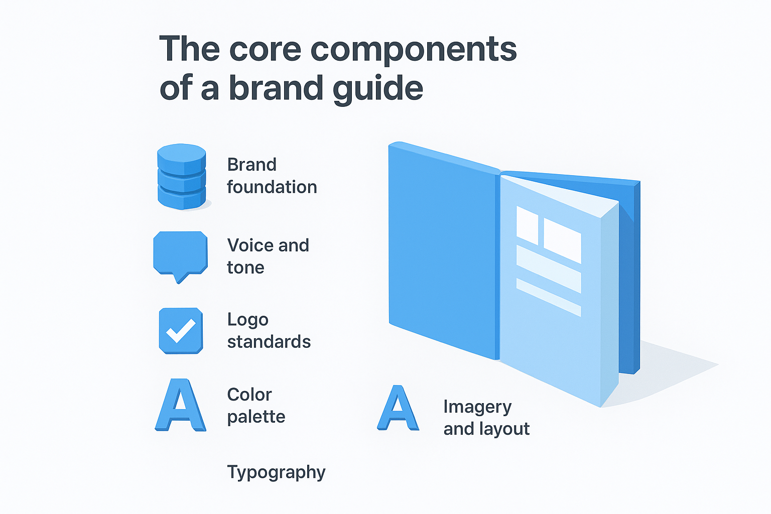
Here is what a complete brand guide covers:
| Component | What it defines |
|---|---|
| Brand foundation | Mission, values, target audience, and brand personality |
| Voice and tone | How you write, what words you use, and how tone shifts by context |
| Logo standards | Approved logo versions, clear space rules, and forbidden uses |
| Color palette | Primary and secondary colors with exact HEX, RGB, and CMYK values |
| Typography | Font families, weights, sizes, and hierarchy rules |
| Imagery and layout | Photo style, mockup treatment standards, and composition rules |
Every component feeds directly into your listing quality. If your color palette is undefined, you will use slightly different shades from one product launch to the next. If your imagery rules are vague, your mockup treatments drift, and your storefront ends up looking like a random collection of designs rather than a product line with a clear identity.
Why sellers need a written system
Most POD sellers carry their brand rules in their heads. That approach works when you are building every asset yourself on a consistent schedule, but it breaks down the moment you outsource a thumbnail, brief a designer on a new collection, or try to replicate a successful listing format four months after you originally built it. Memory is not a system, and it cannot scale.
Writing the guide also forces decisions you have been deferring. The moment you commit your exact primary color as a HEX code, you eliminate all the micro-drift that accumulates over time. The moment you lock in two fonts and document where each one appears, every future design decision gets faster because the answer already exists in writing. Sellers who complete this process report a measurable speed improvement in their design and listing workflow, simply because they stop making the same style decisions over and over from scratch.
What format your guide should take
Your brand guide does not need to be a 40-page PDF with full bleed layouts. For most independent POD sellers, a shared Google Doc or Notion page with clearly labeled sections is enough to start. What matters is that it is accessible, editable, and linked somewhere your whole workflow can reach it. Keep a PDF version exported for sharing with designers or contractors who need a read-only snapshot. The format serves the function, so start simple and add structure as your brand grows.
Step 1. Define the brand foundation and audience
Everything else in your brand guide rests on this step. Before you can lock in a color palette or pick a font, you need to know what your brand stands for and who it is built for. Without this foundation, every visual and copy decision becomes a guess, and your guide ends up describing a brand that has no real center.
Your brand foundation is not a marketing exercise. It is a decision about what you are willing to be consistent about, permanently.
Write your mission and values
Your mission statement is a single sentence that explains what you do and why it matters to your customer. It does not need to be poetic. It needs to be true and specific. Use this fill-in template to get yours written:
Mission statement template: "We help [target customer] [achieve outcome] by [what makes you different]."
Example: "We help POD sellers build storefronts that earn trust by delivering production-accurate phone case mockups that match what customers actually receive."
Core values sit directly below the mission. Aim for three to five, and for each one, write one sentence that explains what it looks like in practice, not just what it is. "Quality" tells no one anything. "We never publish a mockup that misrepresents the product" tells everyone exactly what you mean.
Define your target audience
When you learn how to create branding guidelines that actually hold up, one of the most practical things you can do is write a one-paragraph customer profile. This is not a demographic grid. It is a description of one specific person: what they sell, what tools they already use, what frustrates them about their current workflow, and what they need to feel confident in a purchase.
Use this template to build yours:
| Field | Your answer |
|---|---|
| Who they are | Independent POD seller, 100+ active listings |
| What they sell | Custom phone cases on Etsy and Shopify |
| Their main frustration | Mockups that don't match the delivered product |
| What they need to buy | Proof of accuracy, fast file delivery |
Keeping this profile inside your guide means every future decision, from photo style to copy tone, gets tested against one clear question: does this work for that specific person?
Step 2. Set your voice, tone, and core messages
Your brand voice is the personality behind every word you publish. It shows up in your listing titles, product descriptions, social captions, and customer messages, and it either reinforces your brand identity or quietly undermines it. Most POD sellers write in whatever register feels natural that day, which means their copy shifts between casual, formal, enthusiastic, and transactional depending on their mood. Documenting your voice and tone is how you create branding guidelines that hold up when you are tired, rushed, or delegating.
Separate voice from tone
Voice is fixed. It is the consistent personality your brand always has, regardless of the platform or context. Tone shifts depending on the situation, the same way you speak differently in a product description than in a refund message, but your underlying character stays the same. Write your voice as three to four adjectives, then for each one, add a line that explains what it means in practice.
| Voice attribute | What it means in practice |
|---|---|
| Direct | No filler phrases. Say what the product does. |
| Confident | No hedging language like "might" or "could" |
| Approachable | Write to a person, not at them |
| Precise | Use specific details instead of vague claims |
Voice defines who you are. Tone defines how you show up in a given moment.
Write your core messages
Core messages are the three to five statements your brand repeats across every channel. They are not taglines. They are the ideas you want customers to associate with your brand after repeated exposure. Each message should be written in plain language and short enough to fit in a single sentence.
Use this template to build yours:
Core message template:
- Message 1: [What your product does] + [for whom]
- Message 2: [The problem you solve] + [the outcome you deliver]
- Message 3: [What makes you different] + [why that matters to the buyer]
- Message 4 (optional): [A standard or commitment] your brand holds
Once you have these written, paste them at the top of every content brief you hand to a designer or copywriter. When your core messages are visible at the start of every project, your brand stays on track without you having to correct the work after the fact.
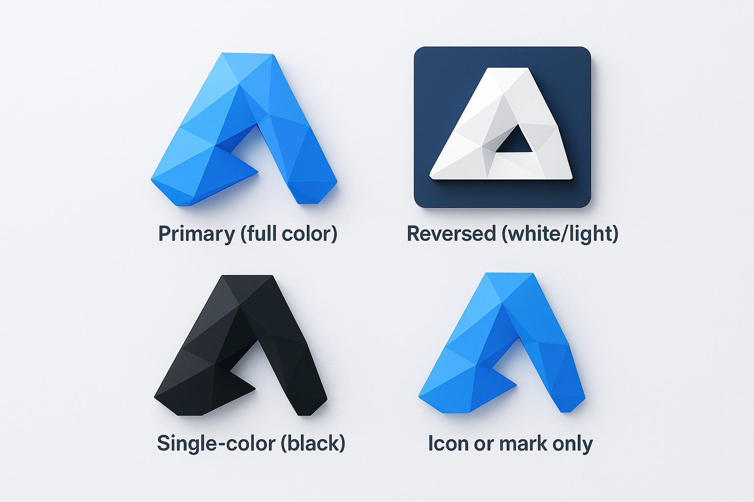
Step 3. Set logo rules and file standards
Your logo is the most repeated visual element in your entire brand, and it is also the most frequently misused. Without written rules, you end up with a stretched version on one listing, a low-resolution export on another, and a color variation someone invented because the original file was buried in an old folder. When you work through how to create branding guidelines, the logo section is where you prevent years of slow visual drift in a single afternoon.
A logo that looks different every time it appears trains your audience to recognize nothing.
Define your approved logo versions
Most brands need more than one logo version to function across different contexts. A full horizontal lockup does not work as a favicon. A dark background version becomes unreadable on a white product photo. Document every approved version of your logo so that anyone building an asset for your brand knows exactly which file to use and when.
Here is a standard set of logo versions to define:
| Version | When to use |
|---|---|
| Primary (full color) | Hero banners, storefronts, main listings |
| Reversed (white/light) | Dark background images, video outros |
| Single-color (black) | Print, embroidery, contract materials |
| Icon or mark only | Favicons, profile photos, small placements |
For each version, document the minimum size it can appear (in pixels for digital, in inches for print), the clear space requirement around it, and a short list of forbidden uses.
Lock in file formats and usage rules
Keeping organized, labeled file formats is the part of logo documentation most sellers skip, and it is exactly what causes the quality problems that surface in product listings and social graphics. Build one master folder with subfolders for each logo version, and inside each subfolder include three file types: SVG for scalable vector use, PNG with a transparent background for digital overlays, and a high-resolution JPG for standard placement.
Use this naming convention template as your file standard:
brandname_logo_primary_color.svg
brandname_logo_primary_color.png
brandname_logo_reversed_white.svg
brandname_logo_reversed_white.png
brandname_logo_icon_black.svg
Document the folder location inside your brand guide and link directly to it so anyone accessing the guide can pull the right file without sending you a message first. This one practice alone saves hours across a year of consistent brand building.
Step 4. Standardize color and typography
Color and typography are the two visual elements your audience encounters most, and they are also the two areas where unintentional drift does the most damage over time. Every time you choose a slightly different shade of blue or swap your heading font for something that felt fresh that week, you chip away at the visual recognition you have been building. Knowing how to create branding guidelines means locking these elements down with exact values, not descriptions.
Lock in your color palette
Your palette needs to be small enough to stay consistent and specific enough to be reproduced exactly. A well-defined palette has a primary color, one or two secondary colors, and a set of neutral tones for backgrounds and text. For each color, document the exact values your team will need across every output format.
Approximate colors produce approximate brands. Exact values are non-negotiable.
Use this template to build your color reference:
| Color role | HEX | RGB | CMYK | Usage |
|---|---|---|---|---|
| Primary | #1A2E4A | 26, 46, 74 | 65, 38, 0, 71 | Headers, CTAs, logo |
| Secondary | #E8732A | 232, 115, 42 | 0, 50, 82, 9 | Accents, highlights |
| Neutral light | #F5F5F5 | 245, 245, 245 | 0, 0, 0, 4 | Backgrounds |
| Neutral dark | #333333 | 51, 51, 51 | 0, 0, 0, 80 | Body text |
Including all four formats ensures your color stays accurate whether a designer is building a digital listing graphic or sending a file to print.
Set your typography system
Two fonts handle almost everything a POD seller needs: one for headings and one for body copy. Layering in a third font adds complexity without adding clarity, and it creates more decisions, not fewer. Pick a heading font that reflects your brand personality and a body font that stays readable at small sizes.
Document your type system in a table so every layout decision has a clear answer:
| Element | Font | Weight | Size (desktop) | Size (mobile) |
|---|---|---|---|---|
| H1 heading | Neue Haas Grotesk | Bold (700) | 48px | 32px |
| H2 heading | Neue Haas Grotesk | Medium (500) | 32px | 24px |
| Body copy | Inter | Regular (400) | 16px | 15px |
| Caption | Inter | Light (300) | 12px | 12px |
Pinning exact sizes and weights to each content element means your storefront banner, listing descriptions, and social graphics all follow the same visual rhythm without requiring a style decision every time you open a new file.
Step 5. Define imagery, mockups, and layout rules
Visual consistency lives or dies in this section. Your logo and colors create the frame, but imagery and layout are what customers actually look at when they land on a listing. Without written standards, your product photos drift toward whatever felt right on any given Tuesday, and your storefront stops reading like a brand. When you learn how to create branding guidelines that hold at scale, this is where the real listing-level work happens.
Set your photo and mockup style
Your imagery rules need to specify three things: the visual treatment for your product photos, the mockup style that matches your manufacturer's actual output, and the contexts where each applies. If you sell phone cases through Podbase or Casestry, your mockup accuracy matters as much as your visual style. A beautiful mockup that misrepresents the camera cutout or finish does active damage to your brand every time a customer receives the real product.
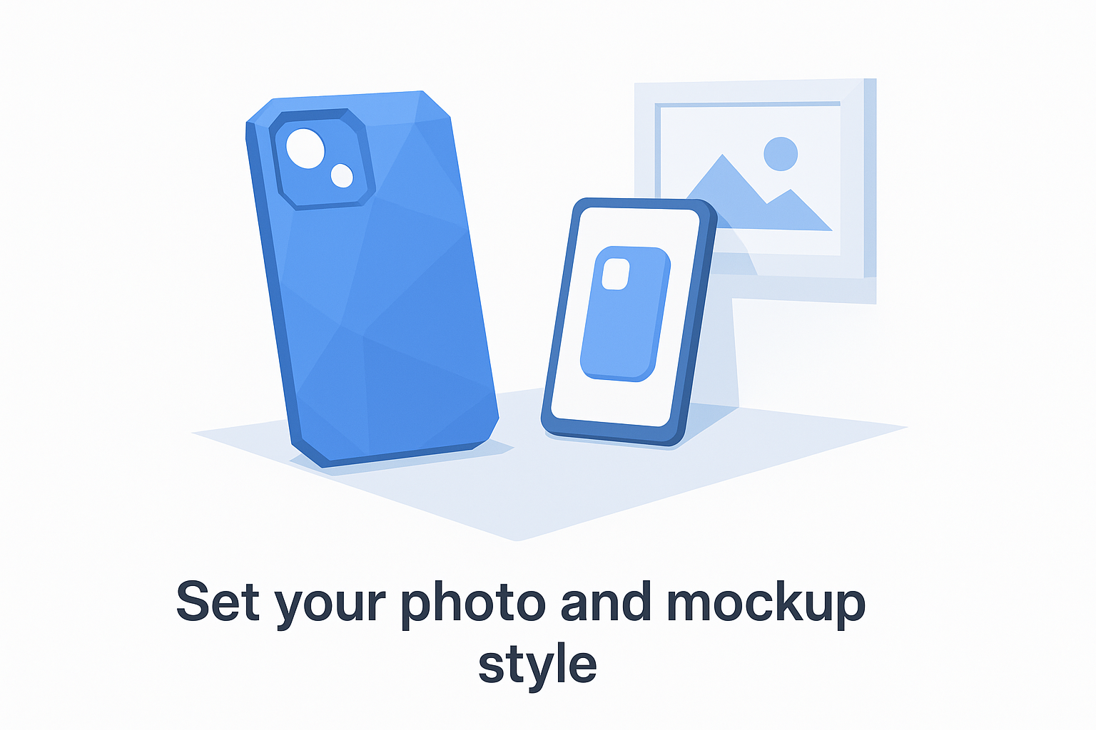
Photorealistic and production-accurate are not the same thing. Your guide needs to require both.
Document your imagery standards using a simple reference table your team can check before publishing anything:
| Element | Standard |
|---|---|
| Background style | Clean white or lifestyle scene, no mixed treatments per collection |
| Finish shown | Must match manufacturer spec (matte vs. glossy per case type) |
| Lighting | Consistent soft natural light, no harsh shadows |
| Mockup source | Production-matched templates only |
| Video mockups | Required for TikTok Shop and paid social placements |
Define your layout system
Layout rules tell anyone building an asset where elements go and how much space surrounds them. Without this, your listing banners, social graphics, and storefront headers all use different margins and proportions, and the result looks careless even when the individual pieces look fine.
Write your layout rules using three fixed values: a standard margin (the minimum space between any element and the edge of a canvas), a content column width expressed as a percentage of the total canvas, and a maximum number of design elements allowed in any single composition. For most POD sellers, a 5% margin, an 80% content column, and a three-element limit keeps layouts clean without requiring a graphic design background to execute. Document these as a short reference block at the end of your imagery section so they stay connected to the visual standards they support.
Step 6. Roll it out, govern it, and keep it current
A completed guide that lives in a single person's Google Drive does nothing. The final step in how to create branding guidelines that actually work is treating the rollout and governance process with the same seriousness you brought to building the guide. You need to put the document where your workflow already lives, establish a clear process for updates, and assign someone, even if that someone is just you, as the owner who decides when the guide changes and when it does not.
A brand guide that no one references might as well not exist.
Share it where the work happens
Accessibility determines adoption. If your guide requires someone to remember a folder path or ask you for a link, it will not get used consistently. Pin the guide link inside every tool your team touches regularly: your project management platform, your design tool workspace, your shared asset folder, and the top of every creative brief you send to contractors. Make "check the brand guide" the default behavior, not an optional step.
When you bring in a new designer, VA, or copywriter, send the guide before any project brief. Add a short note confirming which sections apply to their specific work so they do not have to read the entire document before starting. This shortens onboarding time and cuts the revision cycles that come from avoidable style inconsistencies.
Build a simple review schedule
Your brand guide is a living document, not a one-time project. Set a fixed review date every six months and block it on your calendar now. At each review, check three things: whether any visual standards have drifted from what the guide prescribes, whether new platforms or product lines require additional rules, and whether any section is being consistently ignored because it is unclear.
Use this template to track each review:
| Review date | Section reviewed | Change made | Reason |
|---|---|---|---|
| 2026-06-01 | Color palette | Updated secondary HEX | New product line launch |
| 2026-06-01 | Imagery rules | Added Reels spec | TikTok Shop expansion |
Log every change with a date and a reason. This gives you a record of how your brand has evolved and prevents conflicting versions from circulating across your team.
Put your guide to work
You now have a complete framework for how to create branding guidelines that hold up across hundreds of listings, multiple platforms, and any team you bring in to help. The six steps in this guide cover everything from brand foundation to imagery standards, so consistency stops being something you hope for and starts being something you build into every asset you publish.
Start with the section that costs you the most right now. If your mockups are misrepresenting your product, that is the place to begin. Sellers using production-accurate mockup templates alongside clear visual standards report fewer refunds and stronger reviews because the brand promise matches what the customer actually receives. Your guide only works when the assets it governs are built to the same standard you documented. Check out phone case mockup templates built to manufacturer specs and give your brand guide the visual foundation it needs to perform.


