
Every font choice you make tells your customers something about your brand before they read a single word. Pick the wrong typeface for your Etsy shop header, mix too many weights across your product listings, or forget to specify sizing for your mockup overlays, and the whole visual identity falls apart. Brand typography guidelines exist to prevent exactly that: the slow, unnoticed erosion of brand consistency that turns a professional storefront into a forgettable one.
For print-on-demand sellers especially, typography shows up everywhere, listing images, mockup templates, social ads, packaging inserts, and without documented rules, every new design becomes a coin flip. At Bettermockups, we build production-accurate phone case mockups for POD sellers, and we see firsthand how consistent visual branding (typography included) separates shops that look like real companies from shops that look like they started last Tuesday.
This guide walks you through how to define, document, and implement typography rules for your brand identity. You'll find best practices, real examples from established organizations, and practical specs you can use to build your own typography guidelines from scratch, whether you're a solo seller or managing a small creative team.
What brand typography guidelines include
Brand typography guidelines are a documented set of rules that tell anyone working on your brand exactly which fonts to use, how to size them, where to apply them, and what to avoid. They're not just a font list. A complete typography guideline document covers typeface selection, hierarchy, spacing, color pairing, and platform-specific usage rules. Without that full picture, your Etsy listings, email headers, and social ad overlays will drift apart over time, and customers will notice even if they can't name exactly what feels off.
Skipping this step feels like busywork before the real work. It isn't. Documenting your typography rules once means every future design decision gets made faster and more consistently, whether you're building a new product mockup, writing a promotional banner, or briefing a freelancer on your brand. The upfront investment pays back every single time someone touches your visual identity.
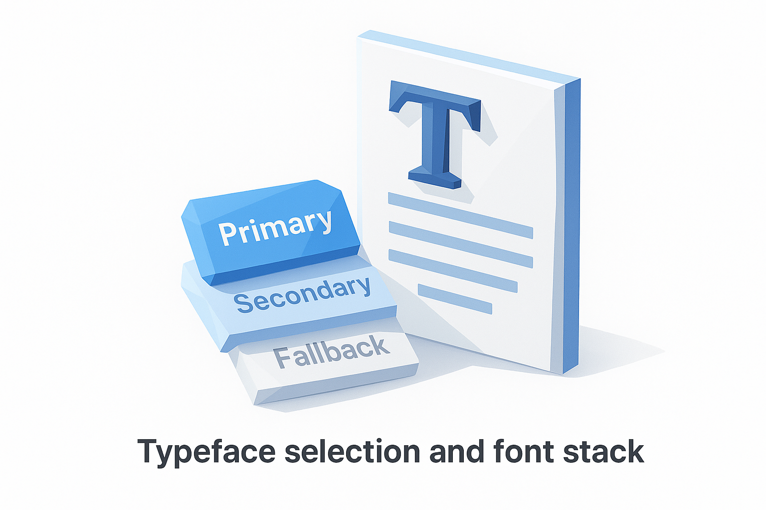
Typeface selection and font stack
This is where your guidelines start. You identify your primary typeface (the font that carries your brand voice), your secondary typeface (used for body copy or supporting elements), and any fallback fonts for web or email environments where custom fonts may not load.
A basic font stack entry in your guidelines looks like this:
Primary: Playfair Display (headings, display text)
Secondary: Inter (body copy, UI labels)
Web fallback: Georgia, serif / system-ui, sans-serif
Each entry should specify the font name, its intended use case, and where to source it, whether that's Google Fonts, Adobe Fonts, or a licensed file you own. Skipping the source detail causes immediate problems when a contractor or new team member tries to replicate your work and pulls the wrong cut or weight.
Hierarchy and sizing rules
Hierarchy defines the visual order readers use to scan your content. Your guidelines need to specify exact size values for each text level: heading 1, heading 2, body, caption, and any other roles you use regularly.
Consistent type hierarchy is what makes a design feel intentional rather than assembled.
Here's a simple sizing table you can adapt directly for your own brand:
| Text role | Font | Size | Weight |
|---|---|---|---|
| Heading 1 | Playfair Display | 36px / 2.25rem | Bold (700) |
| Heading 2 | Playfair Display | 28px / 1.75rem | Semi-bold (600) |
| Body | Inter | 16px / 1rem | Regular (400) |
| Caption | Inter | 12px / 0.75rem | Regular (400) |
Line height and letter spacing belong in this table too. A heading without a specified line height will look cramped on one designer's screen and stretched on another's, which undermines the whole point of having documented standards in the first place.
Channel-specific usage rules
Your brand typography guidelines need to address where and how type gets used, not just which fonts you've chosen. Print, web, email, and social assets each impose different technical constraints, and your guidelines should account for all of them.
For example, a custom serif font might render beautifully in a Photoshop mockup template but become unreadable at small sizes in a mobile email client. Each channel entry in your guidelines should specify the approved fonts for that environment, the minimum font size, and any format restrictions such as embedding requirements for PDF or web-safe substitutions for HTML email. That level of detail is what separates guidelines that actually get used from documents that get ignored after the first week.
Set your type system and font stack
A type system is the foundation your brand typography guidelines are built on. Before you document any rules, you need to select the typefaces that will carry your brand's visual identity and define exactly how each one gets used. Most brands need two typefaces maximum: one for display and headings, one for body copy and supporting text. Adding a third font is occasionally justified, but more than that creates visual noise without adding value.
Choosing fewer fonts and using them with precision will always outperform a wide collection used inconsistently.
Choose your typefaces with purpose
Your primary typeface does the heavy lifting for headlines, product titles, and any text that needs to communicate your brand personality at a glance. Your secondary typeface handles body copy, captions, UI labels, and any text where readability at smaller sizes matters more than character. When you select these, match them to your brand's tone: a geometric sans-serif signals modernity and precision, while a humanist serif suggests craft and trust.
Use this framework to evaluate each typeface you're considering:
- Legibility at small sizes: Does it hold up at 12px on a mobile screen?
- Weight range: Does the family include enough weights (regular, medium, bold) to cover your hierarchy without requiring a second font?
- Licensing: Can you use it commercially in print, web, and social without restrictions?
- Format availability: Is it available as a web font, a downloadable file, or both?
Build your font stack for every environment
Once you've selected your typefaces, document the complete font stack including fallbacks for web and email, where custom fonts may not render. Without fallback rules, a broken font load will default to whatever the browser picks, and that default almost never matches your brand. Write your stack so any designer or developer can implement it without guessing.
Here's a ready-to-use font stack template you can adapt directly:
Primary typeface: Playfair Display
  Use case: Headings, display text, product titles
  Source: Google Fonts (free, commercial license)
  Web fallback: Georgia, "Times New Roman", serif

Secondary typeface: Inter
  Use case: Body copy, captions, UI labels, email text
  Source: Google Fonts (free, commercial license)
  Web fallback: system-ui, -apple-system, sans-serif
Copy this template into your brand document and fill in your own typeface choices. Every person who touches your brand assets will thank you for it.
Define hierarchy, sizing, and spacing
Hierarchy is what guides a reader's eye through your content in the order you intend. Without it, every element on the page competes for attention equally, and nothing wins. Your brand typography guidelines need to assign a clear role to every text level you use, from your largest display heading down to fine print, and that role should be documented with exact values, not vague descriptions like "large" or "small."
Establish your text roles first
Start by listing every type of text your brand actually uses across all touchpoints. A heading on a product listing mockup, a caption under a photo, a button label, a price display are all distinct roles that need separate rules. Trying to document sizing before you know your full list of text roles means you'll miss something and leave room for inconsistency.
Use this role inventory as a starting template:
- H1 / Display: Main product titles, hero headlines
- H2 / Section heading: Category labels, section breaks
- H3 / Subheading: Supporting details, feature callouts
- Body: Descriptions, paragraphs, listing copy
- Caption / Label: Image captions, fine print, tags
- Button / UI text: Calls to action, navigation labels
Documenting your text roles before setting sizes prevents the most common source of typographic inconsistency in brand systems.
Set size and spacing values
Once your roles are defined, assign specific pixel and rem values to each one so any designer working on your brand assets can implement them without making judgment calls. Rem values scale relative to the browser's base size, which makes them the better choice for web work, while pixel values remain the standard for mockup and print templates.
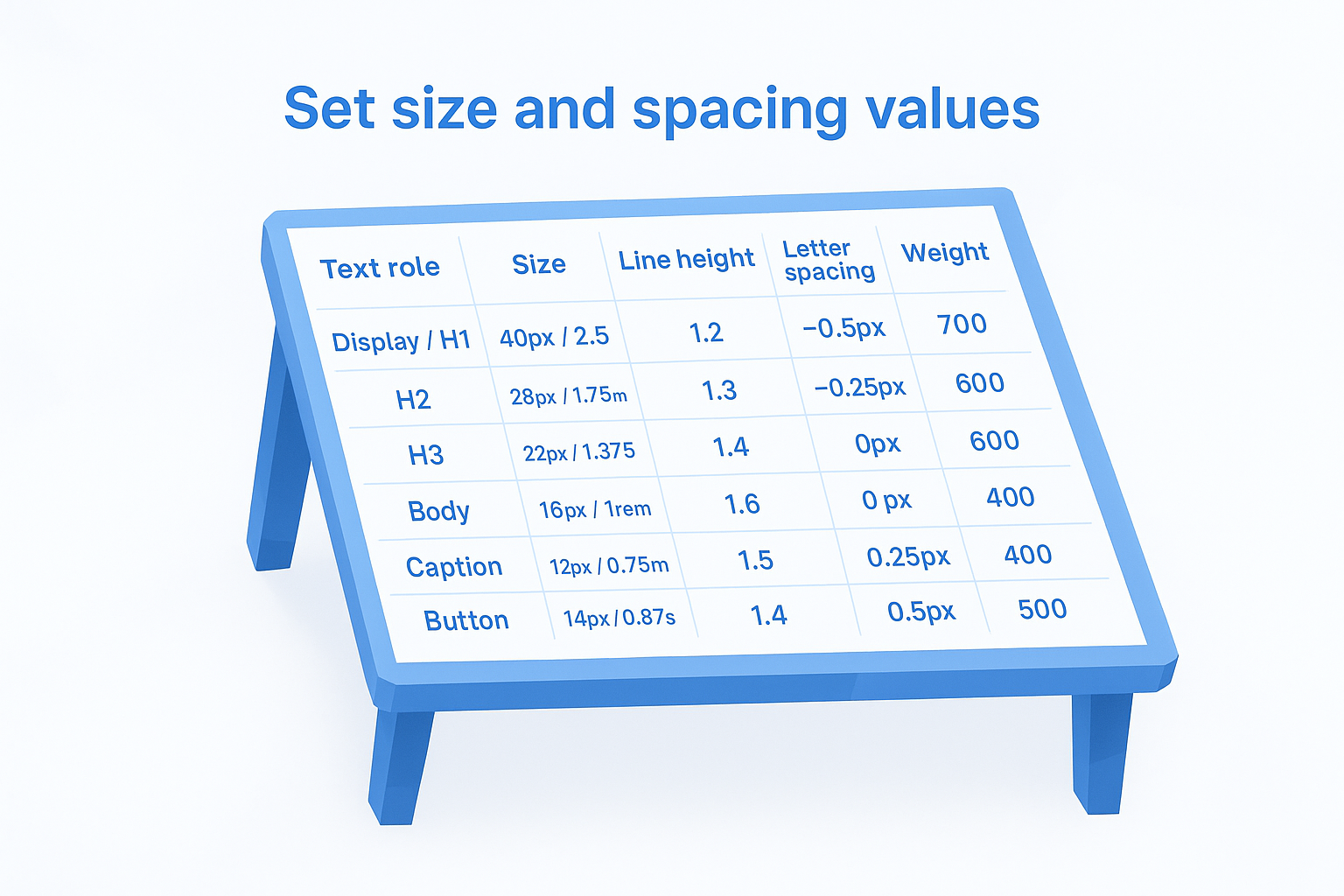
Line height and letter spacing are just as critical as font size, and both belong in the same table. A body paragraph set at 16px with a 1.2 line height reads as cramped; the same text at 1.5 line height reads as clean and open. Document the difference explicitly.
Here is a ready-to-use sizing and spacing table you can adapt directly:
| Text role | Size | Line height | Letter spacing | Weight |
|---|---|---|---|---|
| Display / H1 | 40px / 2.5rem | 1.2 | -0.5px | 700 |
| H2 | 28px / 1.75rem | 1.3 | -0.25px | 600 |
| H3 | 22px / 1.375rem | 1.4 | 0px | 600 |
| Body | 16px / 1rem | 1.6 | 0px | 400 |
| Caption | 12px / 0.75rem | 1.5 | 0.25px | 400 |
| Button | 14px / 0.875rem | 1.4 | 0.5px | 500 |
Fill in your own typeface and brand-specific values, then paste this table directly into your brand document. Anyone touching your layouts can reference it in seconds instead of reverse-engineering what a previous designer used.
Write rules for web, email, and print
Typography rules don't work if they only apply to one channel. Your brand typography guidelines need to specify exactly how type behaves across web, email, and print, because each environment has different technical constraints that will break your brand consistency if you leave them undocumented. A font that looks sharp in a product mockup can become unreadable in a promotional email if you haven't set the right fallbacks and minimum sizes.
Channel-specific rules are what turn a font list into a functional brand system.
Web typography rules
Your web rules need to cover font rendering, loading behavior, and responsive scaling, not just which typeface to use. Specify whether you're loading fonts via a stylesheet or self-hosting them, and document the exact CSS font stack so any developer can implement it correctly.
Here is a ready-to-use web typography rule block:
/* Headings */
font-family: 'Playfair Display', Georgia, serif;
font-size: clamp(28px, 4vw, 40px);
line-height: 1.2;

/* Body */
font-family: 'Inter', system-ui, sans-serif;
font-size: 16px;
line-height: 1.6;
Clamp values let your type scale gracefully between mobile and desktop without requiring separate breakpoint overrides for every heading level.
Email typography rules
Email clients strip or ignore custom fonts in most environments, which means your email-specific rules should lead with web-safe fallbacks and minimum font sizes. Never set body text below 14px in email, and never rely on a custom font rendering correctly without a matching system font fallback.
Document your email stack like this:
Heading: Georgia, "Times New Roman", serif, 24px, bold
Body: Arial, Helvetica, sans-serif, 16px, regular
CTA button: Arial, Helvetica, sans-serif, 14px, bold, uppercase
Sticking to this stack prevents your promotional emails from defaulting to an unbranded system font that undoes all the visual consistency you've built everywhere else.
Print typography rules
Print requires different specifications than screen because resolution, ink behavior, and physical size all affect how type reads. Set your print rules in points (pt) rather than pixels, and specify whether your text renders in CMYK or spot color to avoid color shifts from screen to physical output.
Your print rule block should include the minimum type size for legibility (typically 8pt for body, 6pt for fine print), the approved weights for each text role, and bleed and margin settings for packaging inserts or card collateral.
Handle accessibility, localization, and licensing
Accessibility, localization, and licensing are three areas that brand typography guidelines almost always omit, and that omission creates real problems: inaccessible type drives users away, unsupported character sets break international listings, and unlicensed fonts expose you to legal risk. Treating these three topics as separate afterthoughts rather than core sections of your documentation is the fastest way to undo all the consistency work you've already done.
Make your type accessible
Accessible typography starts with contrast ratios and minimum font sizes that meet the Web Content Accessibility Guidelines (WCAG). Body text needs a contrast ratio of at least 4.5:1 against its background for standard text, and 3:1 for large text (18px regular or 14px bold and above). Any text below 16px in body copy or 12px in captions should be flagged as requiring a contrast check before it ships in any format.

Accessible type is the baseline that makes your brand readable for every customer, not just most of them.
Document your accessible type rules using this checklist format directly in your brand guidelines:
- Minimum body size: 16px on screen, 8pt in print
- Minimum caption size: 12px on screen, 6pt in print
- Contrast ratio (body text): 4.5:1 minimum
- Contrast ratio (large text): 3:1 minimum
- No type-only CTAs: Always pair color with size or weight to signal emphasis
Plan for localization
If you sell internationally or plan to, your chosen typefaces need to support the character sets of every language you publish in. Latin character fonts break on accented characters in French, German, or Spanish if the font file doesn't include extended Latin glyphs. Before finalizing any typeface in your guidelines, verify its glyph coverage using the font's specimen page or the Google Fonts character set viewer for any typeface sourced from that library.
Add this requirement as a single line in your font stack entry: Glyph coverage required: Latin Extended-A minimum. That one line filters out fonts that will fail in localized listings before a designer ever downloads them.
Verify your font licensing
Commercial use licenses and free personal use licenses are not the same thing, and conflating them is a common and costly mistake. Before adding any typeface to your guidelines, confirm the license type covers your actual use cases: web embedding, print, digital products, and commercial resale all require explicit permission, and not every font grants all four.
Use this licensing checklist before finalizing any typeface:
| Use case | License type needed |
|---|---|
| Website or web app | Web license or OFL |
| Print collateral | Desktop or print license |
| Product mockup overlays | Commercial use license |
| Resale in digital products | Extended commercial license |
Borrow patterns from real brand guides
Real brand guides from established organizations give you a shortcut. Instead of inventing every rule from scratch, you can study how major brands structure their typography documentation and adapt those patterns directly to your own system. Looking at what works in a polished, tested brand guide is one of the fastest ways to identify what's missing from your own brand typography guidelines.
What Apple's type system teaches you
Apple's typography approach uses a single typeface family, SF Pro, across nearly every product surface. The key lesson is restraint: one font family with a wide weight range covers every use case without visual noise. You don't need to match Apple's custom typeface to apply this principle. Pick a typeface family with at least four weights, regular, medium, semibold, and bold, and you can build a full hierarchy from a single source rather than reaching for a second or third font.
The most disciplined brand type systems use fewer fonts more precisely, not more fonts more freely.
What NASA's brand standards teach you
NASA's public brand standards document specifies minimum type sizes, spacing ratios, and approved font weights with the same precision you'd expect from an engineering spec. Their guidelines treat typography rules as functional requirements, not aesthetic preferences. For your own documentation, that means specifying values in exact units rather than relative terms. Writing "24px at 1.3 line height" is more useful than writing "large, comfortable heading" because it removes every judgment call from the implementation.
How to extract patterns and apply them
You don't need access to a brand's internal files to learn from their typography decisions. Most major companies publish brand or press kit pages with downloadable assets. Pull three or four examples that match your brand's tone and look for these specific details:
- Number of typefaces used: Most strong systems use two or fewer
- Hierarchy depth: How many distinct text levels are defined?
- Spacing documentation: Are line height and tracking values specified?
- Platform notes: Does the guide address web, print, and mobile separately?
Once you identify the patterns across examples, map each one against your own current documentation and flag the gaps. That gap list becomes your immediate action plan for strengthening your typography system.
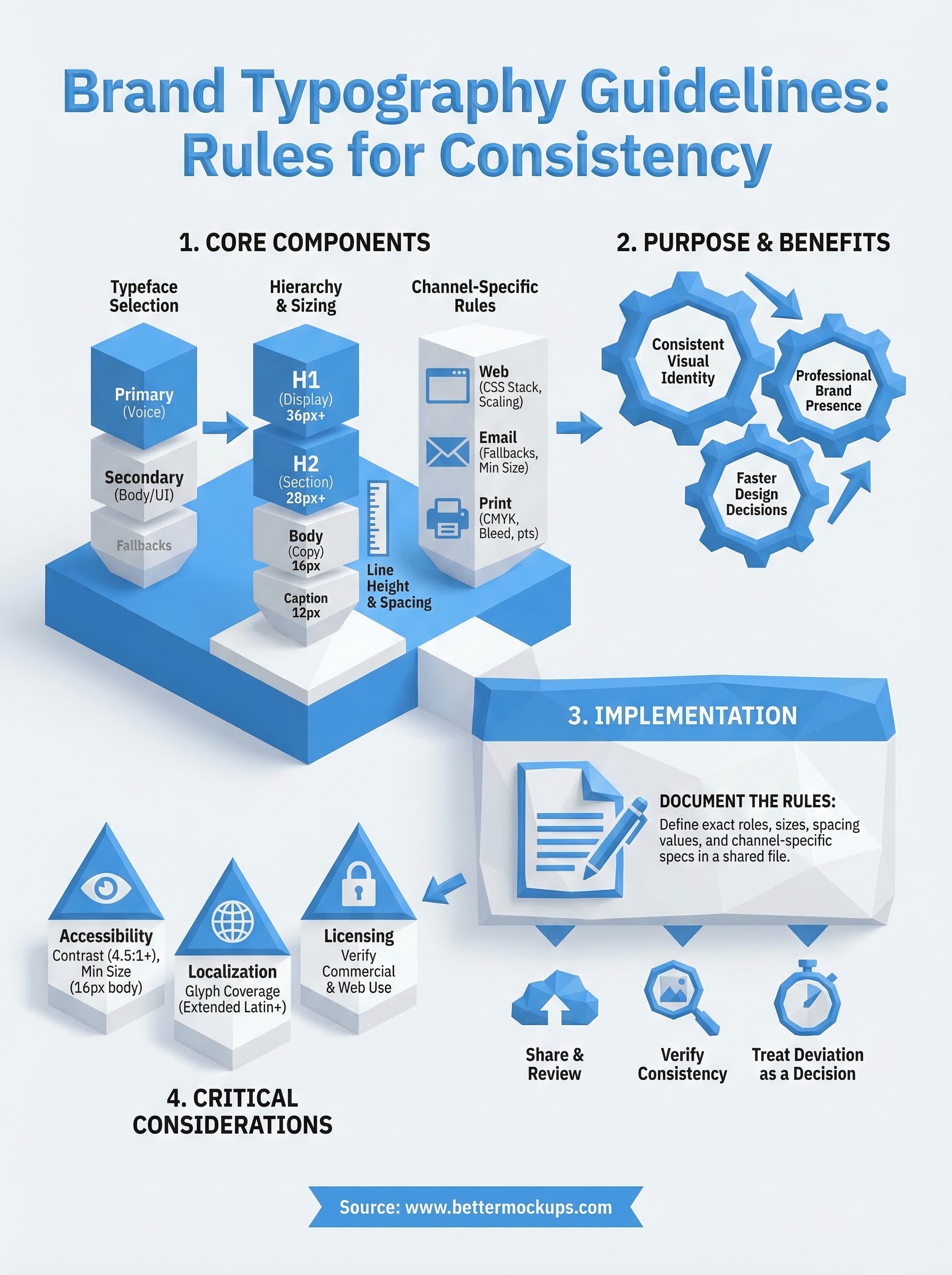
Keep your typography consistent
Your brand typography guidelines only work if you actually use them. Document your rules in a shared file every collaborator can access, review them whenever you add a new product line or channel, and treat any deviation as a decision that requires justification, not a shortcut. Inconsistency rarely announces itself. It builds quietly across dozens of listings and assets until your brand looks like it was designed by five different people.
Start with the templates and tables from this guide, fill in your specific typefaces and values, and publish that document before your next design project begins. A one-page type reference keeps a solo seller consistent across hundreds of listings without extra overhead. For POD sellers who want their product visuals to match that same level of precision, production-accurate phone case mockups give your listings a visual foundation that holds up from the first impression to the delivered product.


