
If you're promoting products on TikTok Shop or running paid social campaigns, you'll eventually need to reference TikTok itself, in a co-branded asset, a marketing deck, or a storefront banner. That's where TikTok brand guidelines come in. They spell out exactly how you're allowed (and not allowed) to use TikTok's logo, colors, typography, and name in your own materials. Get it wrong, and you risk content takedowns or, worse, a violation flag on your seller account.
For POD phone case sellers building real brands on TikTok Shop, the same sellers using Bettermockups templates to create production-accurate video and static mockups for their listings, understanding these rules isn't optional. Every ad creative or branded graphic that features the TikTok mark needs to meet their standards, no exceptions.
This guide breaks down TikTok's official brand identity assets and usage rules: the logo files you can download, the color codes you should match, the typography specs, and the dos and don'ts that keep your marketing compliant. Everything here reflects TikTok's current published standards so you can reference the platform confidently without putting your store at risk.
What counts as official TikTok brand guidelines
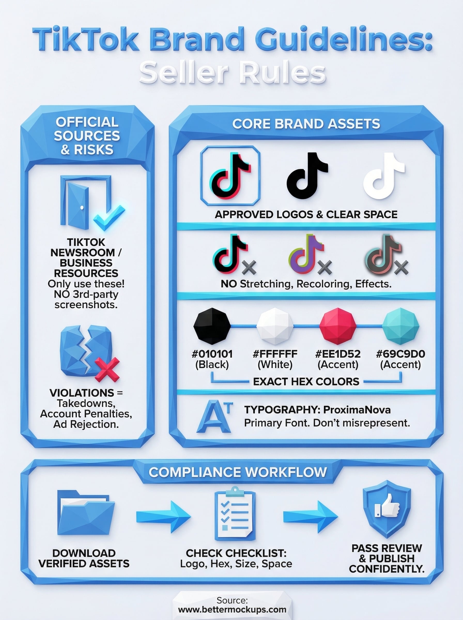
TikTok publishes its brand identity standards through its official Newsroom and Business resource pages. These aren't community summaries or third-party interpretations. They are TikTok's own documentation, covering how external parties, advertisers, sellers, and partners can reference the TikTok name and visual identity in their materials.
Where the official guidelines live
TikTok's brand resources are hosted directly on TikTok's official domain. The primary source is the TikTok Newsroom brand kit, which provides downloadable logo assets and outlines the rules for using them. If you're a TikTok Shop seller running ads or creating co-branded content, this is the document that governs what you can and cannot publish. Any other source, including third-party design blogs or repackaged assets, carries no official standing and should not be treated as authoritative.
Always pull logo files and brand specs directly from TikTok's official resources, not from screenshots or third-party downloads.
What the guidelines actually cover
The TikTok brand guidelines cover four main areas: logo usage, color specifications, typography standards, and naming conventions. Logo usage rules tell you which version of the mark to use and in what contexts. Color specs give you exact values for the brand's signature palette. Typography standards define which fonts represent the TikTok identity. Naming conventions explain how to write "TikTok" in copy, including capitalization and terms you cannot use alongside it.
Sellers and advertisers each face slightly different rules about how they can display the TikTok mark. For POD sellers promoting a TikTok Shop store through paid ads or organic video content, the advertiser-facing rules apply to your creative assets directly. Knowing which category applies to your use case is the first step toward staying fully compliant with every asset you publish.
Why TikTok brand rules matter
Following TikTok brand guidelines isn't just a formality. TikTok actively monitors how its brand assets appear across seller content, ad creatives, and third-party marketing materials. Violations can trigger content removal, account restrictions, or a loss of advertising privileges, all of which directly affect your store's revenue and reach.
Your seller account is at stake
For TikTok Shop sellers, brand compliance carries real operational weight. If your ad creative misuses the TikTok logo or applies unapproved colors, TikTok's review systems can flag and reject the asset before it ever reaches an audience. Repeated violations escalate quickly, and in some cases they result in account-level penalties that limit your ability to run future campaigns or maintain good standing on the platform.
A single non-compliant asset can delay a product launch by days while you wait on an appeal review.
Platform trust works both ways
Your customers notice visual consistency more than you might expect. When your co-branded materials accurately represent TikTok's identity, it signals that your business operates professionally and takes its marketing seriously. Sloppy brand usage, even unintentional, undermines the credibility of your storefront and can reduce buyer confidence before a customer ever reaches your product listing.
How to use the TikTok logo correctly
The TikTok logo comes in several approved versions, and the tiktok brand guidelines specify exactly which version belongs in which context. You'll find a full-color version, a white version for dark backgrounds, and a black version for light backgrounds. Using the wrong version is a direct compliance violation.
Always download logo files from TikTok's official brand resources, not from screenshots or third-party sites.
What you cannot do with the logo
TikTok prohibits a specific set of modifications that sellers frequently miss. You cannot stretch, rotate, recolor, or add visual effects to the logo. These restrictions apply to every asset you publish, including Shop banners, paid ad creatives, and co-branded headers.
Common prohibited actions include:
- Changing the logo's proportions
- Placing it on low-contrast backgrounds
- Adding drop shadows or outlines
- Animating it without explicit approval
Clear space and size requirements
The logo needs defined clear space around it at all times. TikTok specifies this based on the height of the musical note element in the mark. You must also meet minimum size thresholds so the mark stays legible across phone screens and desktop ads alike.
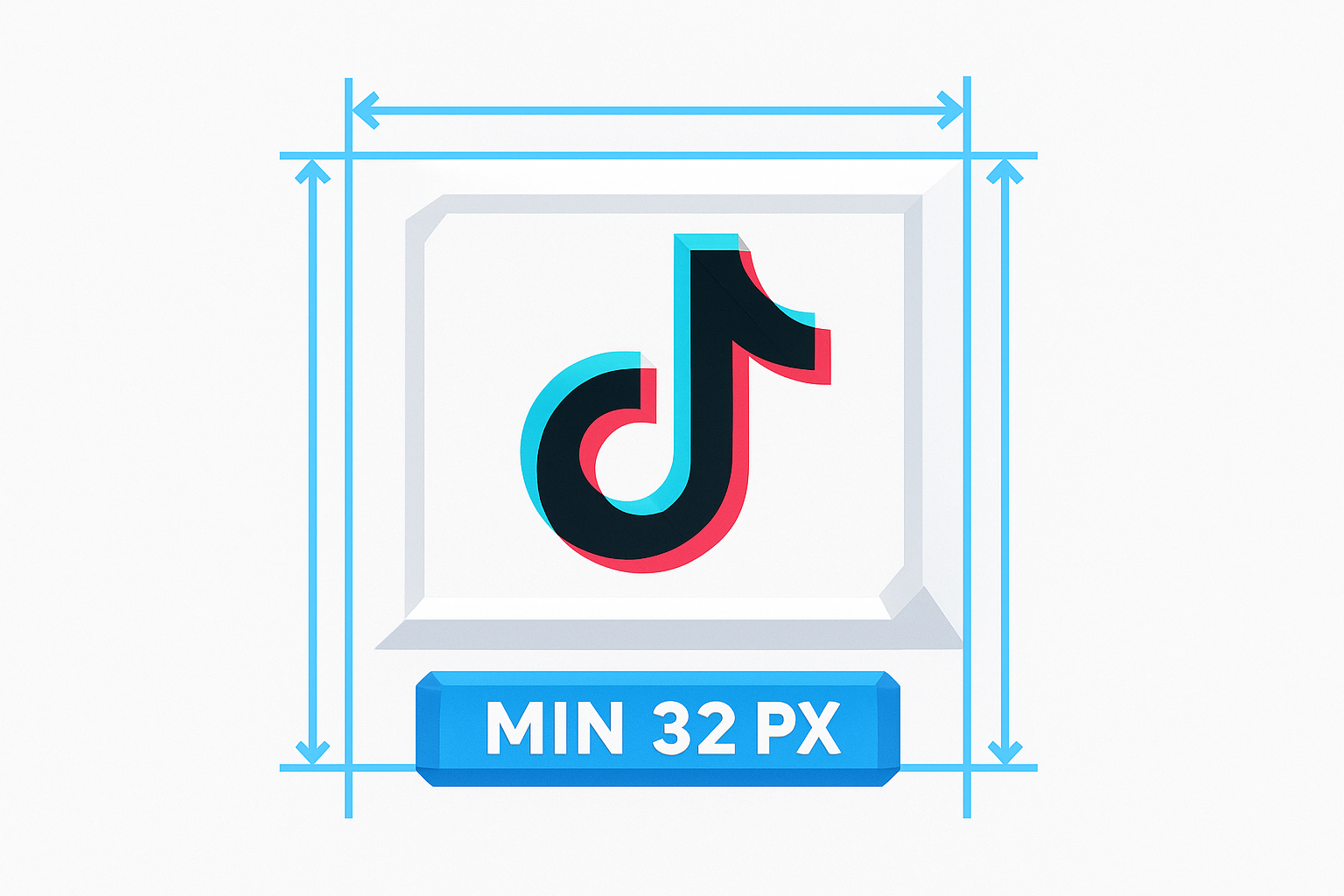
Skipping these specs is a common reason ad creatives get flagged during TikTok's review process. Even if your overall design looks correct, a logo that's too small or too crowded signals a non-compliant asset.
TikTok colors, typography, and layout rules
The tiktok brand guidelines define a precise visual system that extends well beyond the logo. Color, typography, and layout spacing all carry specific rules that affect whether your assets pass TikTok's review process.
Brand colors
TikTok's core palette centers on black (#010101) and white (#FFFFFF) as the primary foundation. The recognizable shadow effect in the logo uses two accent values: #EE1D52 (red) and #69C9D0 (cyan). These are not interchangeable with visually similar shades.
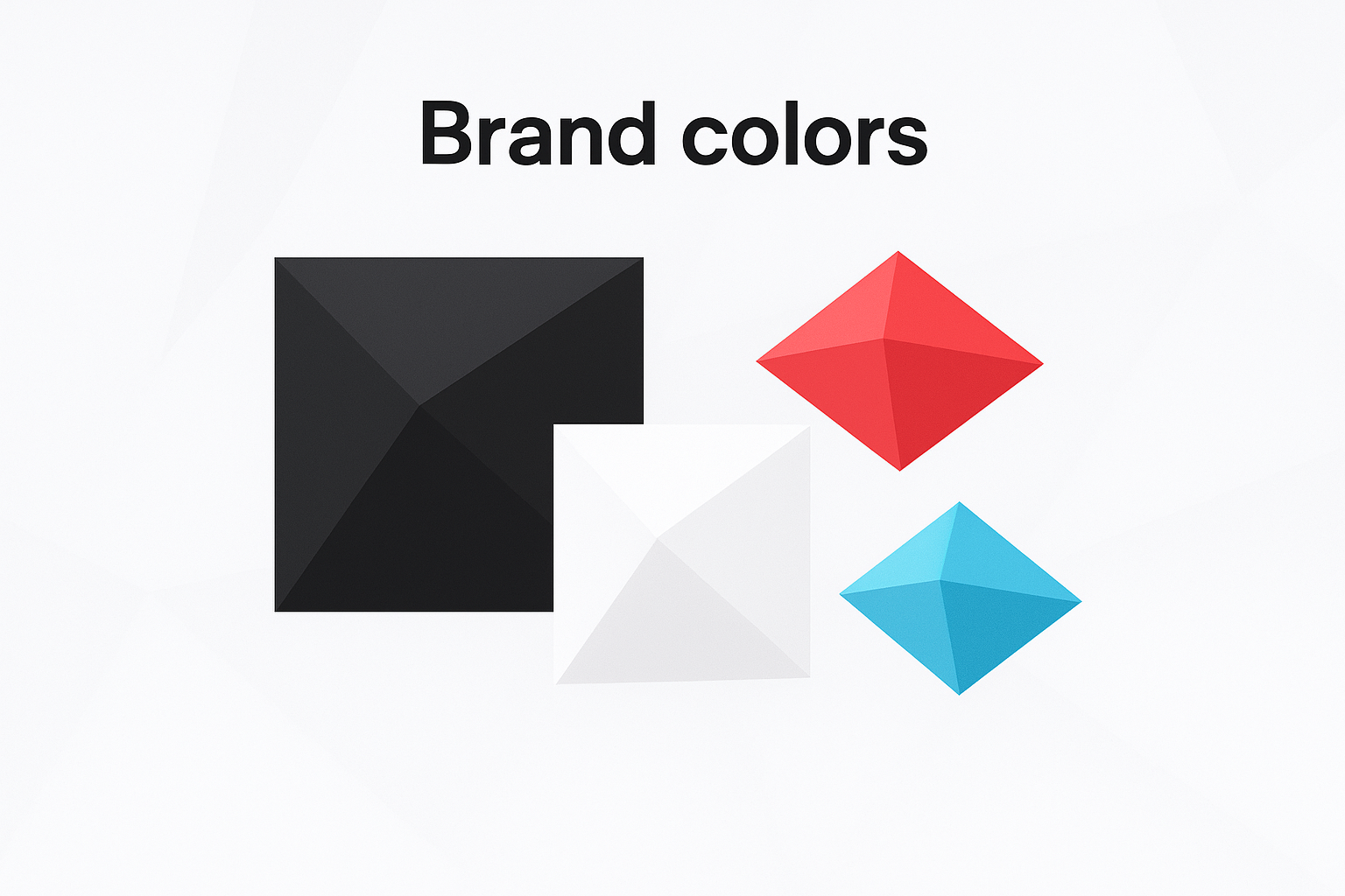
Use exact hex values in every asset you build to avoid rejection during TikTok's review process.
Your ad creatives and co-branded banners must match these values precisely. Approximating the palette or substituting a close-enough color is a documented compliance violation, not a judgment call.
Typography and layout
TikTok uses ProximaNova as its primary typeface in official materials. Your assets should not replicate TikTok's internal fonts or present third-party fonts as TikTok-owned. Misrepresenting the brand's typography is a violation even when the intent is purely aesthetic.
Layout rules require clear padding around all brand elements so no competing visuals crowd the mark. TikTok specifies minimum spacing ratios that preserve the hierarchy of your design and keep the brand identity readable at every ad size you publish.
Common mistakes and how to stay compliant
Most compliance failures with the tiktok brand guidelines come from the same small set of errors. Knowing which mistakes are most common lets you audit your existing creatives before TikTok's review system flags them.
The mistakes sellers make most often
Sellers frequently pull logo files from Google Image searches instead of TikTok's official Newsroom, which means they're working from compressed, incorrectly colored, or outdated versions from the start. Others stretch the logo to fit a banner dimension or place it on a background that fails the contrast requirement.
Downloading assets from unofficial sources is the fastest way to publish a non-compliant creative without realizing it.
How to build a compliant review process
Before any asset goes live, run it against TikTok's published checklist: correct logo version, exact hex color values, minimum clear space, and approved typeface usage. This step catches the majority of violations before they trigger a rejection.
Keep a local folder of verified assets pulled directly from TikTok's official brand resources so every designer or collaborator starts from the same approved source. Treating this as a system rather than an afterthought eliminates avoidable delays before they cost you a campaign launch.
Before you publish anything
Every asset you create that references TikTok must pass against the tiktok brand guidelines before it reaches your audience. That means pulling verified logo files from TikTok's official Newsroom, confirming your hex values match the exact brand colors, and checking that your clear space and minimum size requirements are met. One skipped step is enough to get a creative flagged, delay a launch, or trigger a compliance warning on your seller account.
Your listings are already competing for attention the moment they go live. If your ad creatives get held up in review because of a logo error, you lose that window entirely. Build the compliance check into your production workflow now, not after your first rejection.
For POD sellers who want every part of their listing to hold up under scrutiny, production-accurate phone case mockups are the next piece to get right. Accurate visuals and compliant brand references together make your storefront one that buyers trust and platforms reward.


