
Your logo, your color palette, your product photography style, none of it matters if it changes every time someone encounters your brand on a different platform. Social media branding guidelines are the document that prevents that drift, giving you (and anyone who touches your content) a single reference point for how your brand looks, sounds, and behaves online.
For print-on-demand sellers especially, this goes deeper than picking hex codes. Every listing image, every TikTok video, every Instagram story featuring your phone cases is a brand impression, and if your mockup style shifts between platforms or your tone flips from polished to chaotic, customers notice the inconsistency before they notice the design. That's exactly why we built Bettermockups around production-accurate, visually consistent templates: because brand trust starts with visual honesty, and it compounds across every touchpoint.
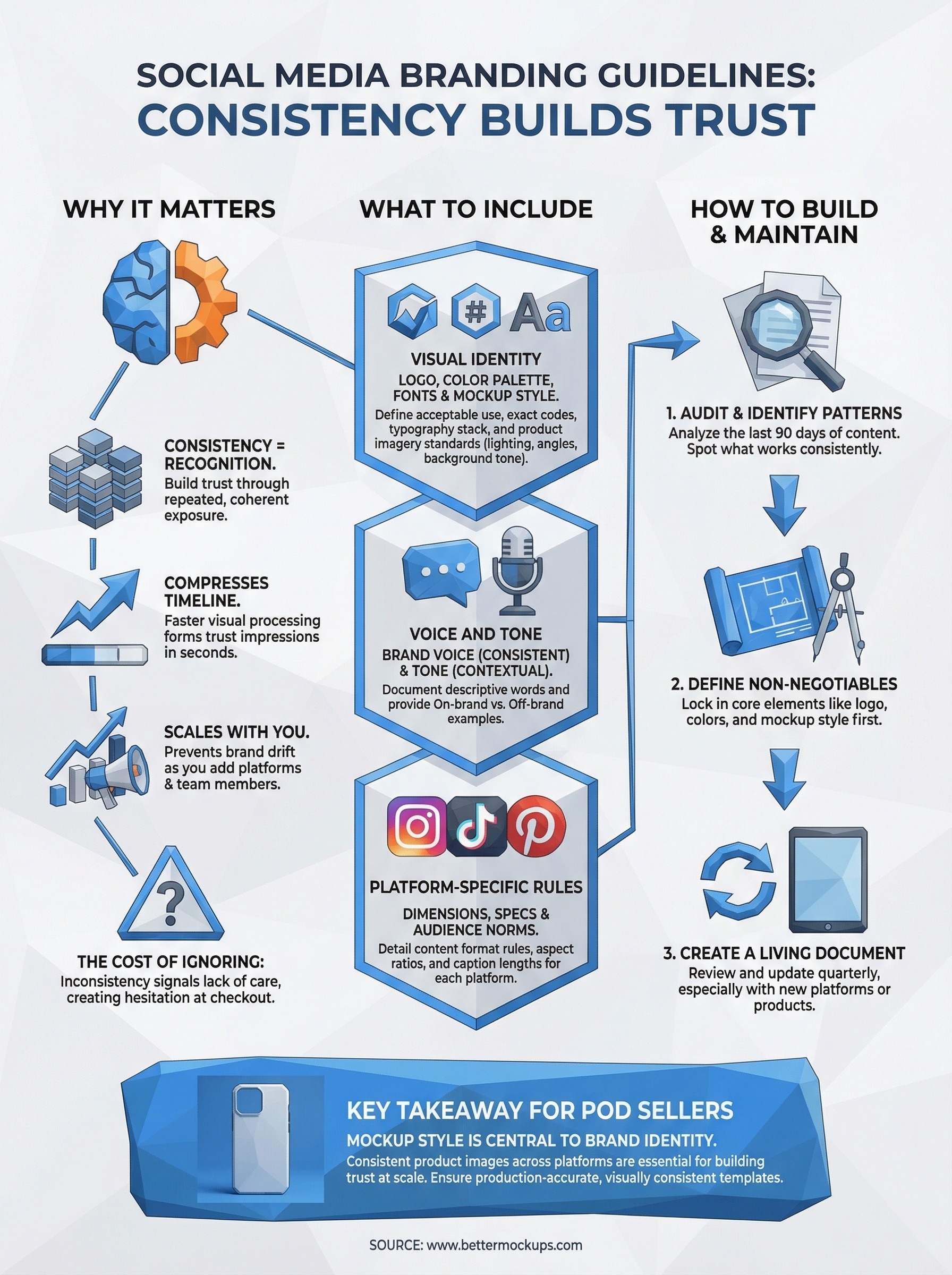
This guide breaks down what belongs in your social media branding guidelines, shows real examples worth studying, and gives you a practical framework to build your own, whether you're running 80 listings or 400+.
Why social media branding guidelines matter
When someone sees your brand three times across three platforms and it looks like three different businesses, they don't connect the dots. Brand recognition is built through repeated, coherent exposure, not through individual standout posts. Your social media branding guidelines act as the stabilizing system that keeps every piece of content pointing in the same direction, even as you add platforms, listings, or team members.
Consistency builds recognition faster than anything else
Your audience processes visuals faster than text, and they form trust impressions within seconds. If your Instagram feed uses one color palette and your TikTok product videos use a completely different one, you spend twice the effort to earn half the recognition. Consistency compresses that timeline. Each impression reinforces the last, and recognition builds faster when your visual language stays stable across every platform.
The brands people remember most are not the ones with the widest creative range; they are the ones that looked the same every single time someone encountered them.
For POD sellers, this plays out directly in your mockup style. If your product images vary in background tone, lighting direction, or device angle between platforms, a customer who finds you on Pinterest and then checks your Etsy shop experiences a visual disconnect. That gap reads as carelessness before they have read a single word of your listing description.
The actual cost of ignoring this
Most sellers treat visual inconsistency as an aesthetic problem rather than a business problem. It is both, and the business side is the more expensive one. Inconsistent presentation across platforms signals to potential buyers that the brand is not managed carefully, which makes them less confident about the product they will actually receive. For phone case sellers specifically, that confidence gap tends to show up as hesitation at checkout, not as a complaint you can address directly.
Repeat buyers and referrals are the compounding returns of brand consistency. A customer who recognizes your style across platforms is more likely to return and more likely to send someone else your way. Every inconsistency you introduce chips away at that effect quietly, one missed connection at a time.
Guidelines protect you when you scale
At 80 listings, you can hold most brand decisions in your head. At 400 listings across four platforms, you cannot. A documented set of guidelines means every new design, every product video, and every caption you write starts from the same baseline. You stop making the same small decisions repeatedly, and you stop introducing variation by accident.
If you ever bring in a designer, a video editor, or a virtual assistant, your guidelines become the onboarding document that prevents them from guessing. The cost of building the document once is far lower than the cost of correcting brand drift after it has already spread across dozens of live listings. Scaling without guidelines does not save time; it just defers the cleanup work.
What to include in social media branding guidelines
Your social media branding guidelines document needs to cover more than just colors and fonts. It should answer every visual and behavioral question someone might face when creating content for your brand, so that decisions happen consistently rather than arbitrarily.
Visual identity
Logo rules come first: acceptable sizes, minimum clear space, approved color variations, and what you never do with it (stretch it, recolor it, drop it on a clashing background). Next, lock down your color palette with exact hex codes for digital use, and define your typography stack including primary and secondary fonts with specific weights. For POD sellers, your mockup background tones and lighting style belong here too, since product images are your dominant visual asset across every platform.

Listing images are often the first brand touchpoint a buyer sees, so your mockup style is part of your visual identity whether you treat it that way or not.
Voice and tone
Brand voice is consistent; tone adjusts to context. Document three to five words that describe how your brand sounds, such as direct, warm, or confident, and give examples of on-brand versus off-brand copy so the distinction is clear rather than theoretical. A short reference table makes this easier to apply day to day:
| Situation | On-brand | Off-brand |
|---|---|---|
| Product caption | "Built for daily carry." | "You're gonna LOVE this!!" |
| Response to a complaint | "We'll fix that for you." | "So sorry for the trouble!" |
Platform-specific rules
Each platform has its own image dimensions, video specs, and audience expectations, and your guidelines should reflect those differences directly. Instagram rewards high-polish static images and short-form video; TikTok rewards motion and pace; Pinterest rewards vertical layouts with clean negative space. Spell out the content format rules for each platform your brand uses, covering aspect ratios, caption length norms, and any restrictions on text overlays so every piece of content starts from the right foundation.
Cover these four areas and you have a document that answers most content questions before they even get asked.
How to build your guidelines step by step
Building your social media branding guidelines does not require a design degree or a three-day workshop. You need a clear process that starts with what you already have and moves toward decisions that are written down and usable, not stored in your head where they can shift.
Start with an audit of what you already have
Pull every piece of content you have published across your platforms in the last 90 days. Look for patterns that work (designs that got engagement, product images that drove clicks) and gaps where the presentation drifted. This audit gives you a baseline so your guidelines reinforce what is already performing rather than starting from scratch.
Your best-converting content already contains your brand guidelines in embryonic form; you just need to extract and document them.
Once you spot the patterns, list the visual and tonal elements that appear consistently in your strongest content. Those become your defaults, the non-negotiables that anchor the document.
Define your non-negotiables first
Start with the elements that appear in every single piece of content: logo placement, primary colors, and product mockup style. If you use Bettermockups templates for your phone case listings, note the specific template style, background type, and device angle you rely on most, because that visual consistency carries over directly to how buyers recognize your brand across platforms.
From there, add your voice and tone rules, then your platform-specific format specs. Work from the center out, not from the edges in. Getting your core visual identity locked first means every other decision has a clear reference point.
Turn it into a living document
Your guidelines are not finished once you write them. Review and update them quarterly, especially when you expand to a new platform or add a new product category. Keep the document somewhere your whole workflow can access it quickly, whether that is a shared folder, a Notion page, or a PDF pinned to your desktop.
The goal is a single source of truth that removes guesswork from every content decision you make going forward.
Examples and swipe file ideas
The fastest way to sharpen your own social media branding guidelines is to study brands that have already solved the consistency problem, then pull out the specific decisions you can apply directly to your own content. You don't need to copy them; you need to understand what they locked in and why it holds up across every platform they publish on.
Brands worth studying for consistency
Apple's product photography is the cleanest example of visual discipline at scale. Every image follows the same logic: clean backgrounds, consistent device angles, and lighting that never competes with the product itself. If you sell phone cases, that principle translates directly. Your mockup backgrounds, device angles, and finish presentation should follow a rule set tight enough that someone could pick your image out of a mixed feed without seeing your logo.

Brands that are immediately recognizable across platforms made one decision repeatedly, not dozens of different ones.
Glossier built its identity through a narrow, consistent color palette and a tone that stays conversational without becoming casual. The lesson for POD sellers is that tone consistency across captions, replies, and bio copy builds the same recognition that visual consistency does. Both systems reinforce each other, and letting one drift weakens the other more than sellers typically expect.
Building your own swipe file
Start a dedicated folder, whether in your browser bookmarks, a Notion page, or a simple camera roll album, where you save content that stopped your scroll. Note what specifically worked: the background choice, the caption structure, the motion style in a video. Over 30 days, patterns emerge that reveal what your audience responds to before you have built enough original data to confirm it yourself.
Pull examples from brands in adjacent categories, not just direct competitors. Home goods, apparel, and accessory brands often solve the same visual consistency problems phone case sellers face, and their solutions transfer more directly than you might expect. Treat what you collect as a benchmark, not a blueprint, and build from there.
Common mistakes and how to fix them
Even sellers who understand why social media branding guidelines matter make the same preventable errors when they sit down to build them. Knowing what those errors look like before you hit them saves you the rework later.
Making rules too vague to use
The most common failure is writing guidelines that sound correct but give no actionable direction. Phrases like "use a clean, professional tone" or "keep colors on-brand" tell you nothing when you are mid-caption or choosing a background for a new mockup. Vague language produces inconsistent output because every person applying it will interpret it differently, including future you.
Fix this by anchoring every rule to a specific example: a real caption, a saved image, a hex code, not a description of one.
Replace abstract descriptions with concrete references. Instead of "professional tone," write three example captions that demonstrate it. Instead of "on-brand colors," list the exact hex codes and show them applied on a real post so the standard is visual, not theoretical.
Treating the document as finished
Your platforms change. Your product line grows. A guidelines document that never gets updated drifts out of sync with your actual content faster than you expect. Sellers typically notice this when a new team member or a new platform exposes how outdated the rules have become, and by then the inconsistency is already live across multiple listings.
Schedule a quarterly review as a recurring task. Check whether your current top-performing content still matches what the document says. If it does not, update the document first, then align your future content to the revised standard.
Leaving product imagery out of the scope
Most sellers document fonts and colors but overlook the fact that product mockup style is the most visible part of their brand on every platform. An inconsistent mockup approach, such as mixing flat 2D templates with 3D renders or shifting background tones between seasons, creates the same recognition problem as changing your logo color without telling anyone.
Define your mockup rules with the same precision you apply to typography: specify the template type, background tone, device angle, and finish representation you rely on across all listings and social content.
Final takeaways
Your social media branding guidelines are not a creative constraint; they are the system that makes your brand recognizable before a single caption gets read. Every section of this guide pointed toward the same outcome: fewer arbitrary decisions, more consistent output, and a visual and verbal identity that compounds across every platform you publish on. Start with what your best-performing content already shows you, lock in the non-negotiables, and build outward from there.
For POD phone case sellers, your mockup style sits at the center of your brand identity, not at the edge of it. If your product images shift between platforms, buyers notice the inconsistency even if they cannot name it. Keeping your listings visually accurate and consistent is the most direct path to building trust at scale. If you want production-accurate templates that support that consistency from the start, explore BetterMockups phone case templates and see what that standard looks like in practice.


